|
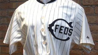
The Chicago Cubs are routinely portrayed as lovable losers -- or sometimes just as losers. So let the record show that with the start of the 2014 MLB season still more than two months away, the Cubbies have already set an all-time record that is unlikely to be challenged anytime soon: On Friday they unveiled a whopping 10 new uniform designs for 2014.  Most of these designs are throwbacks that will be worn only once, but the unveiling still qualified as the biggest single-day, single-team uniform drop in sports history, at least as far as Uni Watch can determine. Toss in the Cubs' home whites, road grays, and alternate blues and you end up with 13 different uniforms in the team's 2014 wardrobe -- presumably another record (and a likely source of considerable headaches for the team's equipment staff). The reason for all the new designs is the 100th anniversary of Wrigley Field. The team had already announced the creation of a centennial sleeve patch that will be worn on the home jerseys this season, and most observers had assumed that we'd also see some throwback uniforms. But the quantity and quality of the new designs caught most of the uni-verse off-guard. So did the timing of the unveiling, which came with no advance warning or fanfare. Let's start with the most conventional of the new designs -- an alternate road jersey. This will co-exist with the team's standard road jersey, making the Cubs one of only two MLB teams with two different sets of road grays. (The only other club with that distinction: the Giants.) The feeling here is that this new design is benign but unnecessary -- a solution to a non-problem. Here's hoping it falls by the wayside in a year or two. But the real news centers on the nine throwback designs. It's not surprising that the Cubs would use a milestone anniversary as the basis for a series of throwbacks -- that's become fairly standard MLB practice in recent years. But coming up with nine separate designs -- one for each decade from the 1910s through the 1990s -- is a serious undertaking. It amounts to the biggest, most comprehensive throwback program any team has ever produced. Let's take a look at those nine throwbacks, along with the dates when they'll be worn and some feedback on each one (click on the team name and year to see the throwback design and the original uniform on which it's based): 1. 1914 Chicago Federals home (to be worn April 23). Very interesting choice here because this uniform was never worn by the Cubs. It was worn by the Chicago Federals, who played in the short-lived Federal League and were Wrigley Field's original tenants. (The Cubs were playing at West Side Park at the time and didn't move to Wrigley until 1916.) So this uni honors Wrigley's history more than the Cubs'. In fact, it will be worn on the 100th anniversary of Wrigley's first game. Also, note that this isn't a traditional button-front jersey -- it's a pullover henley, with only four buttons. Kudos to the Cubs and Majestic for maintaining that detail. Grade: A 2. 1929 Cubs home (to be worn May 4). Gotta love that little bear holding the bat. Also, this design shows how the Cubs were one of many, many teams that have worn the "wishbone-C" insignia. Should look great on the field, especially if the players wear historically accurate striped stirrups. Grade: A- 3. 1937 Cubs home (to be worn May 18). This throwback honors one of many innovations the Cubs have brought to the uni-verse: the first zippered MLB jersey. It's not a bad design, but the road version, with its boldly underlined chest lettering, would have been a better choice. Grade: B 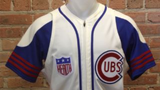
4. 1942 Cubs home (to be worn June 8). So many great details on this one. First, the jersey is a zippered vest (another Cubs innovation, which they came up with in 1940). But unlike other MLB vests from recent years, this throwback isn't just a standard jersey without its sleeves. This throwback was designed with a completely different tailoring pattern -- larger in the armholes and narrower across the shoulders -- which is true to how old-school MLB vests used to be. Big points to the Cubs and Majestic for doing this one properly. The original version of this uniform featured an unusual long-sleeved undershirt with a white shoulder yoke and red stripes on the sleeve cuffs (all of which looked even weirder on the powder blue road version). But with the throwback game slated for June, the Cubs have come up with a short-sleeved undershirt and have maintained the stripes -- not a bad solution, although it lacks the elegance of the original. Finally, true to its 1942 roots, the throwback includes the Hale America "Health" patch, which all MLB teams wore that season. (To learn more about the story behind this patch, look here.) Grade: A- 5. 1953 Cubs home (to be worn June 22). A perfectly pleasant design, but not very exciting as a throwback. Another missed opportunity to revive the underline-centric road version. Grade: C+ 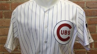
6. 1969 Cubs home (to be worn July 13). The Cubs wore this design for a 10-year span, so it's interesting that they're pegging the throwback to 1969 -- not exactly a banner year in Cubs history. But whatever, it's a very solid design, helped along by that great cub sleeve patch. And if they really want to be historically accurate, they'll inscribe each player's uni number inside his batting helmet logo, which was standard Cubbie protocol at the time. Grade: B+ 7. 1978 Cubs road (to be worn July 27). Here we have the only reverse-pinstriped uniform in modern MLB history. Hey, things were a little weird in the '70s. Looked odd at the time, seems absurd in retrospect, but absurd oddities often make for the best throwbacks. Grade: A 8. 1988 Cubs home (to be worn Aug. 10). Not sure why they bothered with this one. OK, so it's a pullover jersey instead of a button-front, and the pants will have the 1980s-style elastic waistband instead of a belt, but it's still too similar to their current home uni. What's the point? Grade: C- 
9. 1994 Cubs alternate (to be worn Aug. 24). This was never a good design -- the chest script reminded many observers of the Cuban national team's uniform and never felt very Cubs-like. But again, oddities and historical hiccups are ideal fodder for throwbacks, and this one does a capable job of reviving a forgotten chapter in Cubs uni history. Grade: B+ All in all, not bad, right? But it could have been even better. Here are some overlooked entries from the Cubs' uniform timeline that could have been -- and in some cases should have been -- included in the throwback program: • In the early 1940s, the Cubs wore pleated pants. (Yes, really.) Imagine today's players suiting up in those! • The 1934 Cubs had a jersey logo that showed a cub winding up to throw a pitch. Hot-cha-cha! • Due to a manufacturer's error, the Cubs' 1972 road uni featured the only jersey in MLB history with a centered number, sort of like on a basketball jersey. You can get the full story on that here. • You don't often see a baseball team wear its city name and its team on the same jersey, but the 1957 Cubs managed to pull it off on their road grays. Sort of endearingly dorky. • And speaking of the '57 Cubbies, they had some seriously striped stirrups. And so on. Cubs uniform history is a particularly deep rabbit hole -- the team could easily have come up with an intriguing throwback for every week of the season. But hey, they had to draw the line somewhere. Now we just have to get the White Sox, with their wacky uniform history, to do something similar. Paul Lukas is particularly excited about that 1942 vest design. If you liked this column, you'll probably like his Uni Watch Blog, plus you can follow him on Twitter and Facebook. Want to learn about his Uni Watch Membership Program, be added to his mailing list so you'll always know when a new column has been posted or just ask him a question? Contact him here.
|