
The 2019 Major League Soccer season kicks off on Saturday -- with seven matches on ESPN+, and D.C. United hosting Atlanta United (6:00 p.m. ET) and Sporting Kansas City visiting LAFC (8:30 p.m. ET), both airing on ESPN on Sunday -- and with the start of a new campaign comes a host of new kits.
ESPN FC spoke to the players who will be wearing them on the pitch, the man behind their designs, Adidas senior designer for football apparel Christian Jeffery, to explain his creations, as well as a secret designer who has experience designing in MLS and for clubs and federations around the world, to give us an uncensored appraisal of each kit from the inside of the industry and help rank them from the Great to the Yawn to the Oh, Dear.
The Great
1. Vancouver Whitecaps
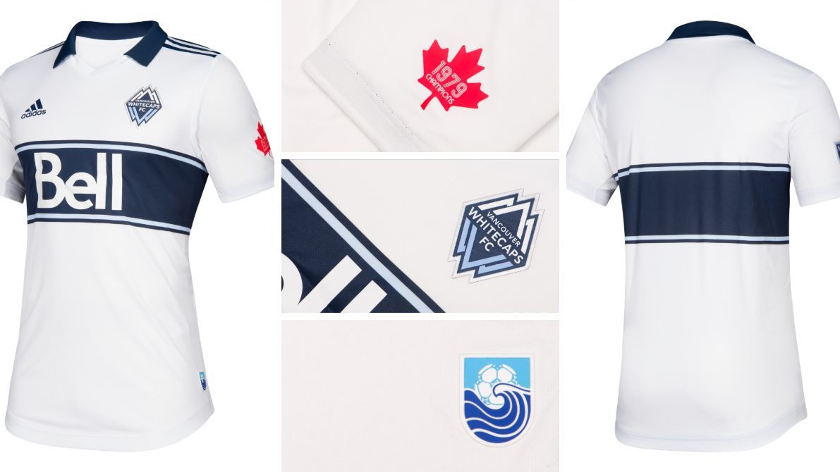
What the players say: "It's a retro jersey from '79, so I think it was the first jersey when they came to play, and I like the contrast between the white, blue and red. I like the numbers being in red because it reminds me of Canada. So, the contrast of the jersey is what I like the most." -- Felipe Martins, midfielder
What Adidas says: When we first started brainstorming with Vancouver, we wanted to tell the story of the 1979 championship. It's something very, very special for the fans, so we wanted to bring back that memory for them. So we have the 1979 signoff. We have the original crest in the jocktag area. But, of course, every Vancouver fan is going to know that really famous bar across the chest.
What our secret designer says: Phenomenal work here. The band wrapping all the way around the top is unique and well executed, and the sponsor fits perfectly within it. This club comes with quality kits year in and year out, but this one might be their best ever. Love the red name and numbers too.
2. Portland Timbers
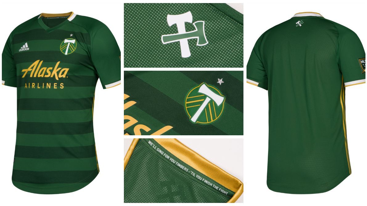
What the players say: "I like these lines -- the new stripes because they are different -- the new material too for the same reason and because it reminds me of the logs Timber Joey cuts at the games." -- Diego Valeri, midfielder
What Adidas says: You see this bar effect from afar, and when you get up close, you see that it's actually made up of even thinner lines. The execution of the engineering of the different structures really makes this jersey. It's all about the fabric, it's all about how we've executed those hoops in a different way.
What our secret designer says: So pleased to see the Timbers continue to move away from the chartreuse and into this gold as an accent color. The gold trim is delightful, the hoops remind me of a stack of logs and the call-out to the fans on the neck tape is a really nice gesture. Absolutely love it.
3. Atlanta United
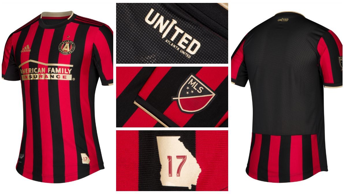
What the players say: "I love the jersey. The star and the stripes celebrate what we have accomplished, as the 2018 MLS Cup champions. We earned it together and we play for you, Atlanta." -- Josef Martinez, forward
What Adidas says: It's a striped kit, but not just the same one; we worked really hard with Atlanta to make sure we could bring that bit of difference to the fans.
What our secret designer says: Maybe I'm giving the champions the benefit of the doubt on these minimal changes, but I'm glad to see the stripes on the sleeves and back, which is not always easy to incorporate with the Adidas Three Stripes, and the gold sponsor is a huge win -- no doubt LAFC will be jealous. Classy.
4. Seattle Sounders
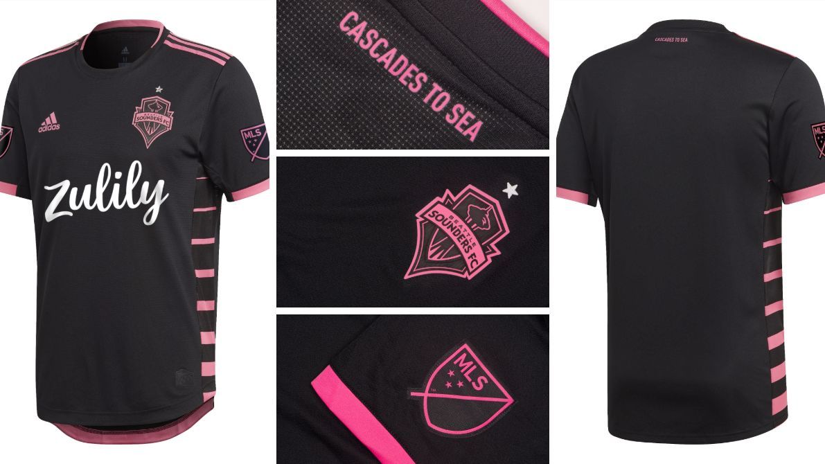
What the players say: "I like the new jersey. A new sponsor always changes something about the jersey, and maybe it will be lucky too. I like the look of the script letters." -- Nicolas Lodeiro, midfielder
What Adidas says: This is all about doing something bold, doing something unexpected. How do you do that? The pink was a perfect way of having a new color pop for them, that's one bold thing, and another bold thing is how do you combine that with a graphic that's not too overpowering, which is why we talked with the club and came up with this really nice idea together to put it on the side panel.
What our secret designer says: Kudos to the club for taking a risk here and making a full departure from its brand colors, but it's a shame that the sponsor logo has to be white. Overall, this is a very stylish shirt.
The Good
5. Real Salt Lake
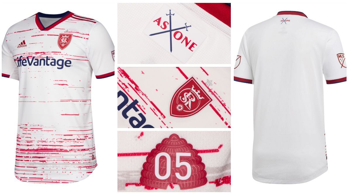
What the players say: "It's the best white jersey that we've had. The thing that I like about it most is the splash of the red color. I like a white kit, so I'm happy that this one looks so good." -- Albert Rusnak, forward
What Adidas says: It's a very progressive graphic, so we wanted to make sure the colors were quite grounded. That's why we wanted to tone it down with the white, the red and the blue and make sure there weren't too many colors inside the graphic.
What our secret designer says: I know it wasn't done for cost-saving reasons, but give me that print pattern on the sleeves and the back, please! The tonal red crest is a nice touch, and that it looks like a heart is a happy coincidence.
6. FC Cincinnati

What the players say: "I love the stripes -- they caught my eye from the first impression and the crest. I love the crest, specifically the lion in the crest, because we are going to fight." -- Kendall Waston, defender
What Adidas says: I think Cincinnati has huge potential for the future. It's a very modern start to Cincinnati because of the bold colors, because of how the blue and orange can combine together, and they have such great graphical elements.
What our secret designer says: The stripes are fresh; the orange and blue vibrate in a funky way. I hope to see more of this sort of originality from the club in the future. But points must be deducted for there not being an authentic version of this shirt, even if that's down to the compressed timeline that sees the team join the league this year.
7. New York City FC
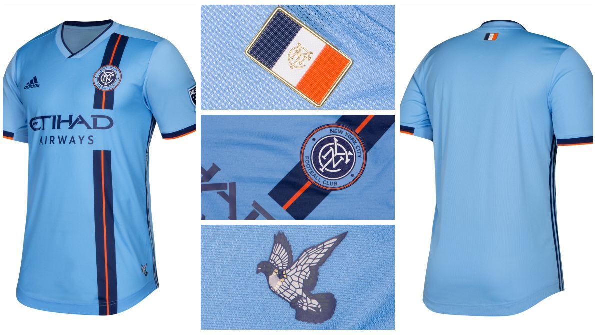
What the players say: "I like the line going down the side of the jersey. It really makes the jersey stand out and it's really nice." -- Maxi Moralez, midfielder
What Adidas says: It's a bold stripe, it's a modern interpretation of the city flag and it's reiterated with a really, really nice sign-off on the back neck that we've got of the flag, which reiterates the story. It is a little bit different. It's not a striped jersey, it's not a jersey that has a stripe down the front, it's a little offset.
What our secret designer says: The city-inspired details are fantastic: the pigeon (!), the NYC flag and the stripe through the crest reminds me of Massimo Vignelli's famous subway map of the city. They've clearly done their homework.
8. LA Galaxy
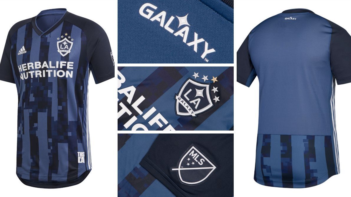
What the players say: "I like the five stars." -- Zlatan Ibrahimovic, forward
What Adidas says: We were speaking to the club about how we can integrate the story of their fifth MLS Cup title, and we had all this imagery around it, and we were thinking, "How do we bring this to life? How do we combine this with a digital creation?" So we took all this imagery, we Glitched it, we transformed it, then made it more abstract. We combined it with these different shades of navy, and what we ended up with in the end was this totally new version of a stripe.
What our secret designer says: The colors are great, but the pattern could've really popped with an infusion of yellow -- it would've made for a "Starry Night" vibe. Also, the jocktag is a little tired; it's time to retire the "This Is LA" verbiage.
9. LAFC
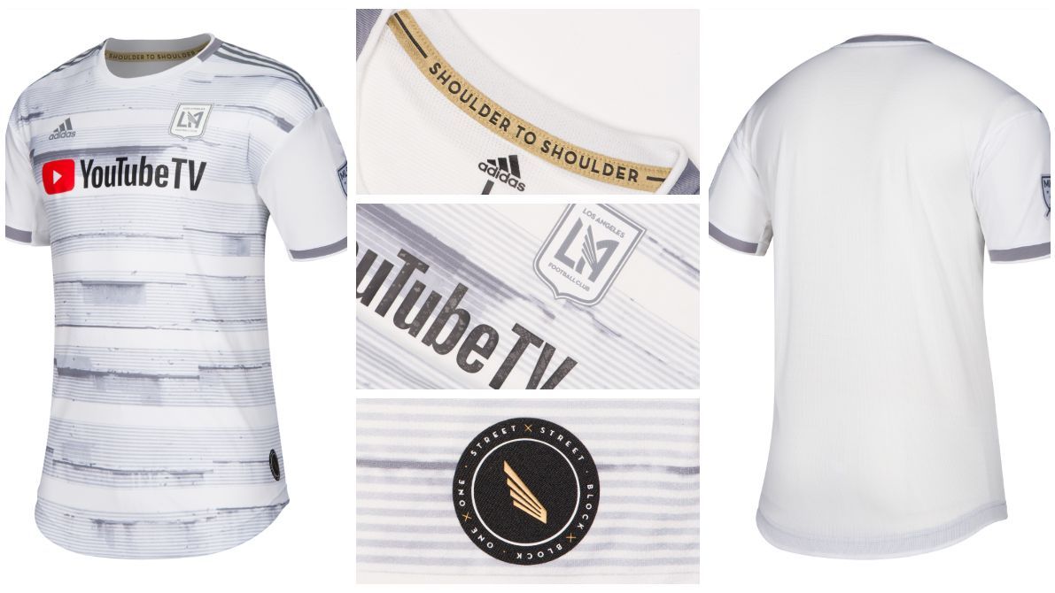
What the players say: "I really like the concrete detail that was implemented into the new away jersey -- it conveys the streets, strength and grit of the City of Los Angeles." -- Christian Ramirez, forward
What Adidas says: This was a case of how will we take the city DNA and reproduce it on a football jersey in a modern way. We started looking at textures around the city; we were inspired by what is essentially a concrete jungle. But how do you translate that to a football shirt? So we took this imagery of a concrete jungle, and we looked at it through this digital lens of how we can hack it to create this hoop.
What our secret designer says: "Street by street, block by block." When you consider the inspiration of Los Angeles' endless sea of concrete, this take on hoops is really quite fresh. It's good storytelling. But I'm not a fan of the crest's inverted colors.
10. Sporting Kansas City
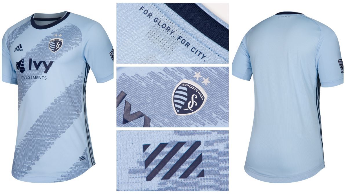
What the players say: "I really like that we are using new colors now. It's just a slight change so opposing teams and fans may not notice. It's something special that we will be able to appreciate with Sporting KC fans, best fans in MLS. Lookin' good, feelin' good, that's my motto." -- Daniel Salloi, forward
What Adidas says: They have this really nice graphic language inside their crest with these sashes, so how can they do that in a little bit of an unexpected way, something that hasn't really been done before on a football jersey? We really then began playing with "What is too much Glitch? What is too little Glitch?" and different shades of blue, and in the end we came up with this really nice balance.
What our secret designer says: Diagonal stripes are unique, although I'd like to see a little more contrast in colors, and the Glitch pattern fits well with Adidas' seasonal design direction. SKC always takes good care of their kits, and this is no different.
11. Chicago Fire
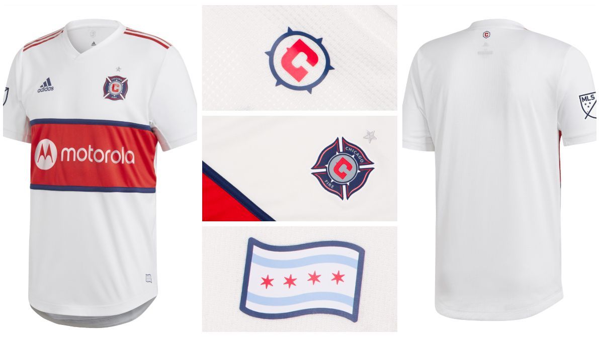
What the players say: "Our new white kits are very sleek, in my opinion. There are so many subtle aspects to it that really make it a special jersey. I particularly love the addition of our new partner Motorola's logo. It complements the jersey extremely well and blends right in." -- Dax McCarty, midfielder
What Adidas says: With Chicago, we have quite a classic chest tube design, but what we've done with the base color -- with it being white -- is it's a slightly more modern interpretation of the Chicago flag.
What our secret designer says: It pairs nicely with the home kit, which is important, and the new sponsor fits perfectly in the band -- which I wish would wrap around the shirt, like Vancouver's. It's simple, but I don't think the fans will remember this one as anything special.
12. Houston Dynamo
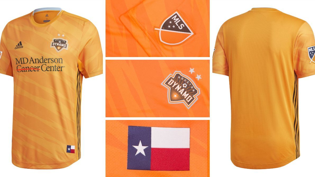
What the players say: "The orange color is always beautiful, but now with the black lettering, it looks even better." -- Alberth Elis, forward
What Adidas says: For Houston, we were inspired by the inside of the crest. We wanted to do something very youthful and very bold; orange is already quite bold, so you don't want to do too much contrast with the graphic, so that's why we decided to play with these shades of oranges.
What our secret designer says: Love that the "energy" pattern extends to the sleeves, although I'd have liked to see some more contrast in it -- incorporating the club's sky blue color would've been perfect. And the sponsor, having "Cancer" struck through, that's uplifting. I like it.
13. Toronto FC
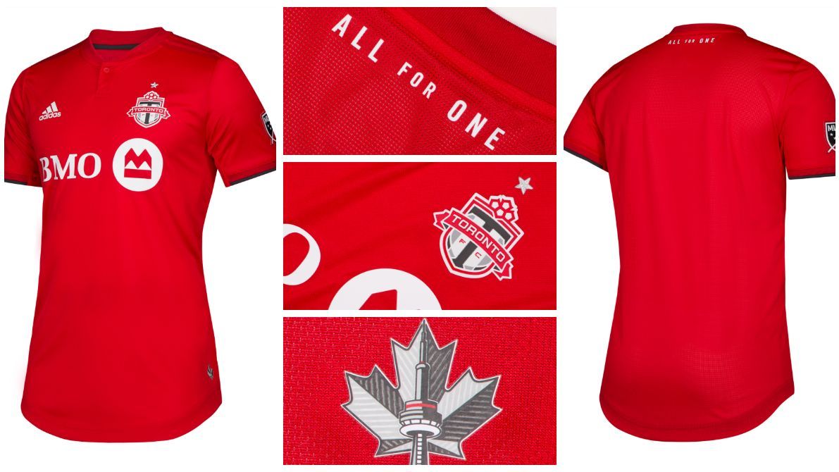
What the players say: "For sure, I have to go with the bottom. We added the CN Tower to the bottom with a Maple Leaf this year. I think that is really cool, and with the unveiling, we did something with the CN Tower. It was awesome and a perfect representation of our city." -- Jonathan Osorio, midfielder
What Adidas says: It's a home kit; we wanted to go in a very classic direction. So it's all about details, it's all about tones of red. We wanted a very clean look, very classic, so we toned down the Three Stripes, we popped the collar and the cuffs in a very subtle way, and then we have just very small, classy little bits of detail.
What our secret designer says: I really like the tonal Adidas Three Stripes -- something the manufacturer is loath to do -- and the placket collar is classy. But the "All for One" verbiage on the back is a little cheesy, and the CN Tower/Maple Leaf jocktag comes off as touristy. I've been to Toronto once, and I could've come up with that.
That's a New Kit? Yawn.
14. Orlando City
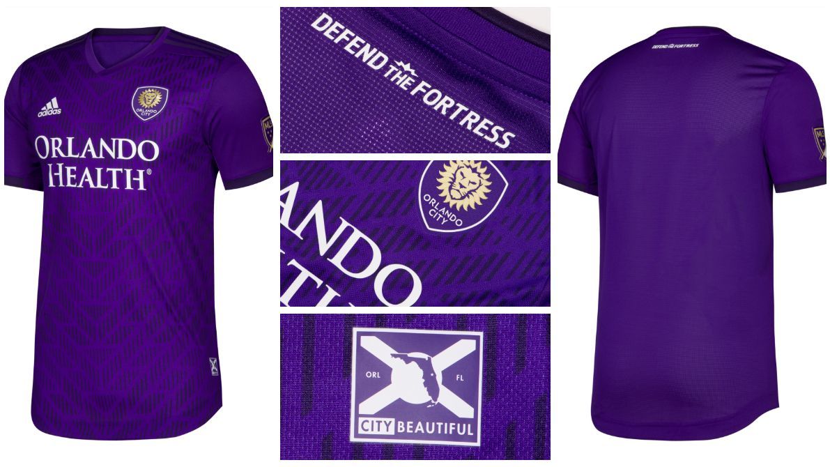
What the players say: "My favorite elements are the black soundwaves that come down, and I like the new patch because it represents Florida." -- Dom Dwyer, forward
What Adidas says: When we initially talked to Orlando, they were talking about "Defend the Fortress," and we were talking about when you get close, these subtle patterns, how can they look bold, how could it look intimidating, and how could that play into what they were talking about? And that's where the whole idea of almost like an armor the players would be wearing came from.
What our secret designer says: I'd have liked to see more contrast in the pattern, and it looks suspiciously like a print Adidas has used in the past couple of years. But bonus points awarded for being the only club in MLS to wear purple.
15. Columbus Crew
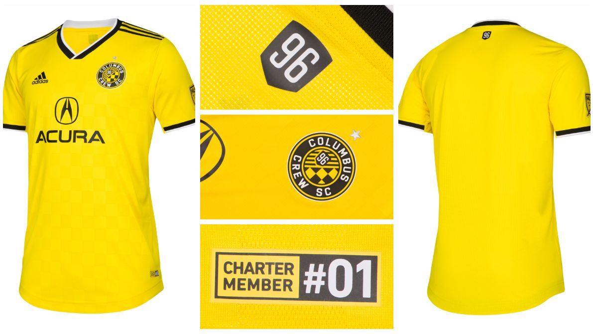
What the players say: "I like the white strip on the collar. I think it's a nice detail." -- Federico Higuain, forward
What Adidas says: In one sense, it's a very classic Columbus Crew jersey, but of course we're always looking to move things forward. From a distance you're going to see a nice, clean kit, but when you get closer you'll see lots of nice details.
What our secret designer says: I had no idea this was a new kit; it looks exactly the same as last year's. It's not bad, but it's a huge missed opportunity considering how powerful the combination of black and yellow is, as well as having diagonal stripes and a checkerboard in their crest to utilize -- the latter of which should've been played up much more on this shirt. In their defense, they didn't even know if they'd have a team this year. #SaveTheCrew
16. Minnesota United
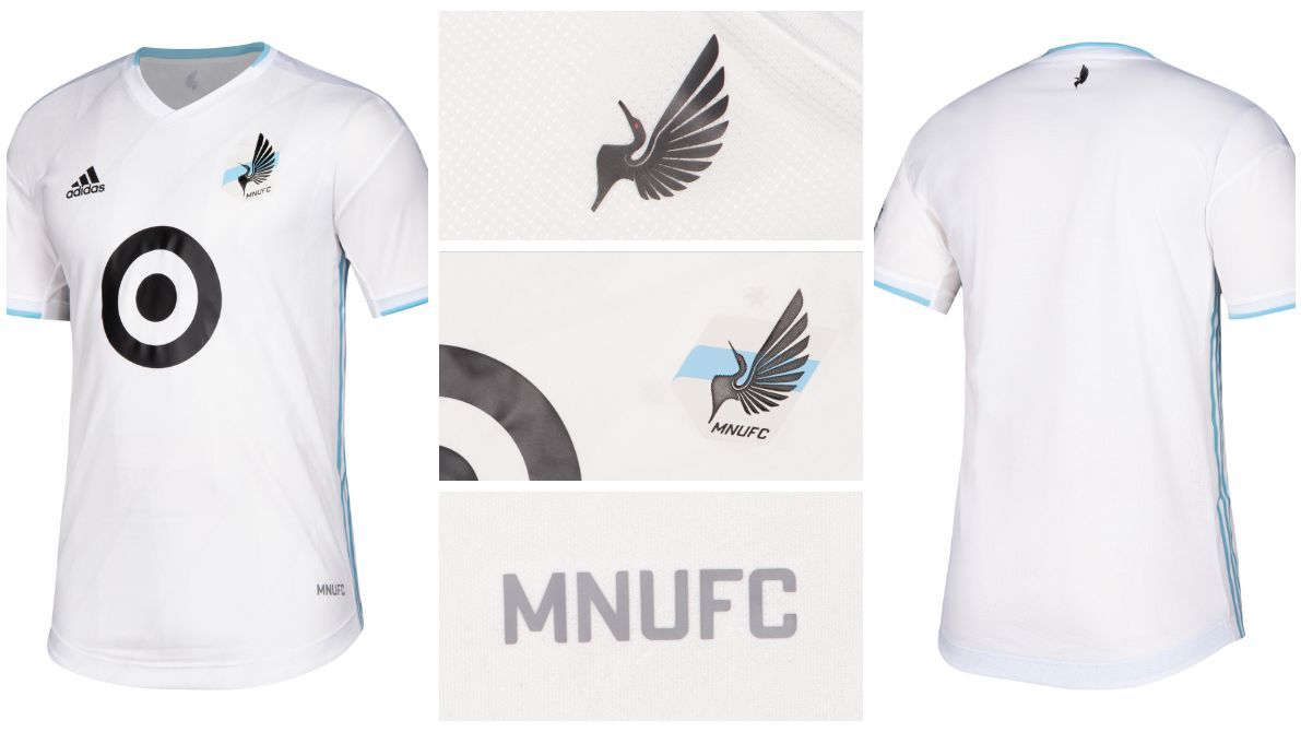
What the players say: "I love the new kit. I like to wear white, and l like how it feels. I can't wait to wear it this season. Hopefully it will not be as nice and clean after our battles at Allianz Field!" -- Jan Gregus, midfielder
What Adidas says: We wanted to strike a balance between having something that was very Minnesota DNA but also gave that point of difference. We started exploring the lines inspired by the sashes inside the crest, and we wanted to do it in a sophisticated way. That's why we decided together that we'd execute it with white. So it's very subtle, but the execution of it is very premium.
What our secret designer says: Inspired by the snow, huh? This pattern is so subtle I honestly can't see it at all. And for a club with arguably the best crest in the league, the "MNUFC" jocktag and Loon logo on the back of the neck are beyond uninspired and extremely disappointing.
17. Colorado Rapids

What the players say: "It's a very nice-looking kit, but my favorite aspect is that it can be worn casually as well." -- Diego Rubio, forward
What Adidas says: The uniqueness about their kit this year is based on the main color. There's lots of white jerseys out there, and we didn't want to produce another one, so that's why we decided to go with a cloud white. It is very subtle, but it's a really nice detail that complements their dark red really nicely.
What our secret designer says: Inspired by the snow, huh? How original. At least the off-white is unique and interesting, and the use of burgundy looks quite classy.
18. D.C. United

What the players say: "It really pays homage to what D.C. is all about. You go around the city, specifically the National Mall, and you're constantly going past marble monuments like the Washington Monument and the Lincoln Memorial. The silver accents to the white jersey really give it a monumental feel and hopefully we can make some history of our own wearing it this season." -- Steve Birnbaum, defender
What Adidas says: We've got a clean white jersey, but on the Three Stripes we've gone with clear gray. We don't do it for everyone, and at Adidas we're extremely proud of our branding, but sometimes the whisper is louder than the shout, and that's the direction in which we've gone with D.C. United.
What our secret designer says: It's sharp, the four silver stars look sensational on that crisp white top, and there's a Real Madrid feel about this shirt -- but you could say that about the offerings in Colorado and Minnesota too. Generally, though, this is a little boring.
The Meh
19. Philadelphia Union
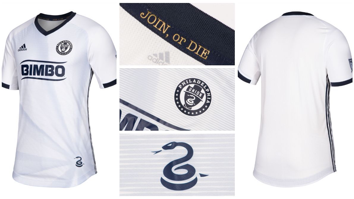
What the players say: "I like the way the colors come together with the subtle stripes to form the starburst pattern. It's a unique design." -- Haris Medunjanin, midfielder
What Adidas says: We wanted to do something with them that was quite bold, and I think we struck the right balance between bold and still looking quite modern. This is, again, something we ran our digital filter through, so although they're rays, it's in a very different way than it has in the past on a football jersey.
What our secret designer says: The pattern is too subtle -- it looks like a blank white kit until you're standing six inches away from it -- and it's bizarre that the sunburst emanates from the jocktag instead of the crest.
20. San Jose Earthquakes
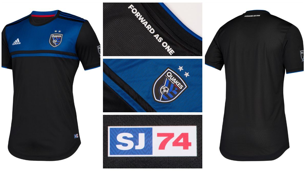
What the players say: "I like the color combination of black and blue. It's powerful." -- Danny Hoesen, forward
What Adidas says: We wanted to make sure the graphic wasn't too overpowering, so you have this really nice combination of when fans see it from a distance, they're going to see this color blocking that's super-interesting, but when you get closer, there's all these really nice details that make it San Jose DNA: all these angular graphic elements inside the blue and black.
What our secret designer says: This looks like the kit a high-school team ordered out of a teamwear catalogue. The tectonic-plate striping pattern in the crest could've been used in so many different ways. It's a huge opportunity missed to ignore that in favor of these boring blocks of color.
21. Montreal Impact
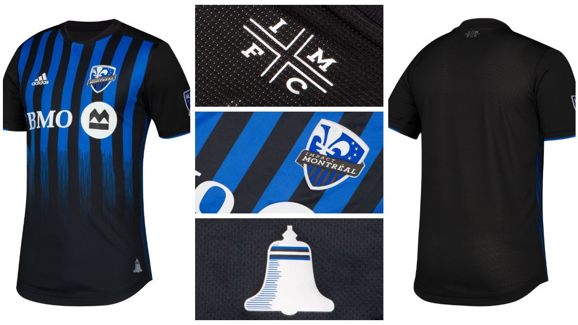
What the players say: "I like the design. I like the stripes and the black that it has in it, and I hope I have good luck in it." -- Ignacio Piatti, midfielder
What Adidas says: We were really happy to see that Montreal wanted to go in a slightly more progressive direction. They've actually got a slight fade within the graphic, which makes them totally unique inside the league, and on pitch it's loud enough that the fans will see it in the stadium, and when you get closer, you can see how that fade is built up.
What our secret designer says: I know big kit manufacturers reuse print rollers to consolidate and keep costs down, but recycling a pattern that a huge club like AC Milan used just two seasons ago is a bookable offense.
22. FC Dallas
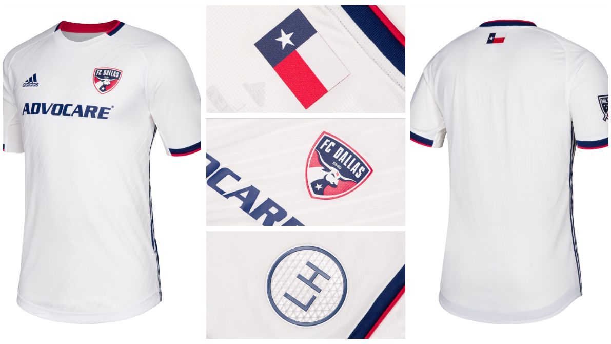
What the players say: "I like the diagonal stripes; they are very pristine and clean. I'm a fan of white jerseys. It's real sharp. It's a good switch-up, good change. I'm excited for it." -- Paxton Pomykal, midfielder
What Adidas says: It was a great idea from the club that they wanted to be inspired by the [Margaret Hunt Hill Bridge], but we don't obviously want to put a picture of a bridge on it. It's how we do that in a modern way, how we interpret that on a football kit. And that's why we have these really nice engineered lines into the fabric.
What our secret designer says: For a club that has given us classy hoops and unique starry patterns in the past, this white T-shirt is beyond boring. Dallas has a rich visual landscape that rivals New York and Los Angeles, and that should've been taken advantage of.
Oh, Dear
23. New England Revolution
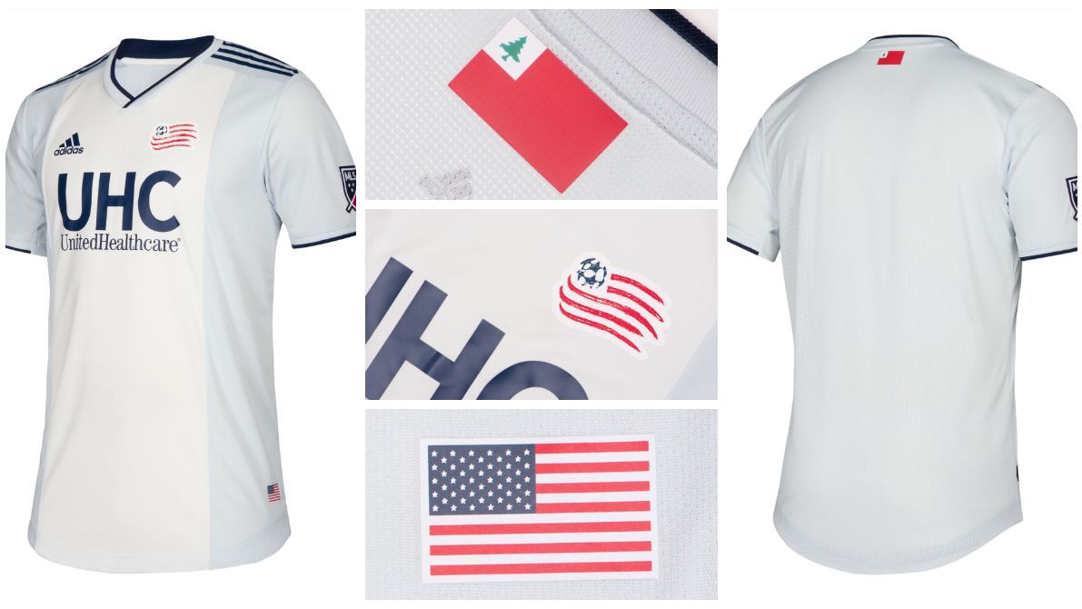
What the players say: "I love the simplicity." -- Teal Bunbury, forward
What Adidas says: It's inspired by the patriot uniform, and it's also got a really nice little piece of detail, so the white inside of it is cloud white. So although it has a very authentic rooting for the fan, the execution of it is a little bit more modern to give it that little twist.
What our secret designer says: The crest is a flag, the jocktag is a flag, the flair on the back of the shirt is a flag. Why are there so many flags? I'd love to see the club rebrand or redesign the crest and leave this sort of mess firmly in the past.
24. New York Red Bulls
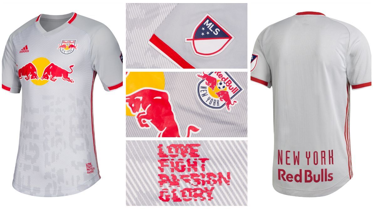
What the players say: "To be fair, I like a lot of things about it, but I think the writing is my favorite part because what it says is perfect. I also like the color. I like that we got away from white. You can wear this jersey more casually. I think it's cool." -- Bradley Wright-Phillips, forward
What Adidas says: One important aspect for us this season inside our creative direction is the idea of digitalization and how we can look at football kits. Within this gray coloring, we have small lines, so as you step farther away from it, you'll really see that "Love, Fight, Passion, Glory," and when you get closer you'll see these really nice detailed lines inside the typography.
What our secret designer says: Gray kits are extraordinarily hard to pull off, and in some cases cursed (see: 1996 Manchester United). This looks like a training top, and the corny verbiage of "Love, Fight, Passion, Glory" is the MLS equivalent of those "Live, Laugh, Love" trinkets that hang in your aunt's living room. Cringe.