
The Milwaukee Bucks will have a new look next season, beginning with a new logo set and a fresh color scheme.
Details of the team's new visual program were unveiled Monday night at the BMO Harris Bradley Center. A few elements had been shown in a teaser video released earlier this month, and some other details had leaked on Twitter over the past two weeks, but this marked the first official confirmation of the team's redesign. New uniforms will follow in June.
And therein lies the rub -- it's frustrating when a team unveils only certain parts of its new design while keeping the uniforms under wraps. Everything that's been unveiled so far was developed within the larger context of the Bucks' new uniform set, so it's difficult to assess the various components in isolation. (And for what it's worth, the feeling here at Uni Watch HQ is that the new uniforms are very good -- better than the logos -- and will be a big hit when they're unveiled in June.)
That said, here are the details and thoughts on what's been unveiled so far:
The colors

The Bucks are going with green and cream, with blue and black being used for accents and trim. The use of cream -- an unusual choice -- reflects Milwaukee's nickname, "the Cream City," which was inspired by the pale yellow bricks used in many of the city's buildings.
Uni Watch's take: Love it. Green and cream are an inspired pairing, and the blue is used judiciously and effectively. Well done.
The primary and secondary logos
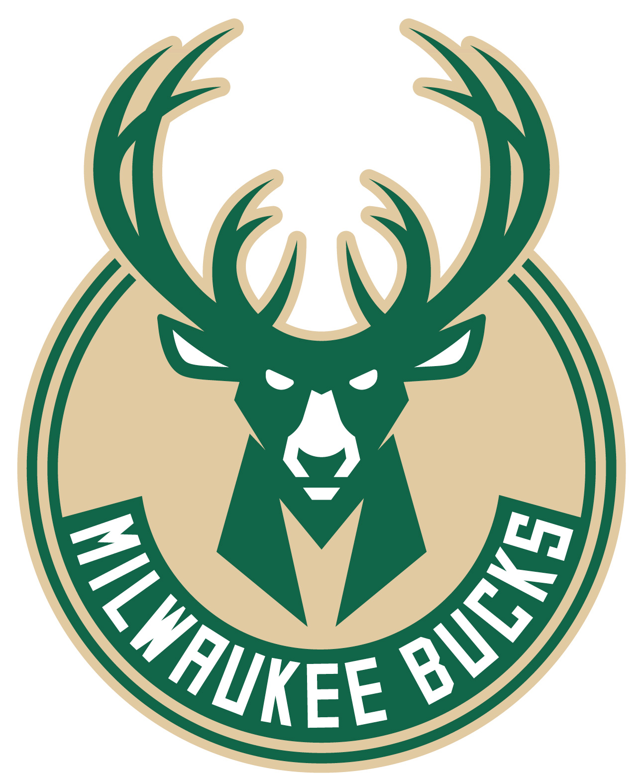
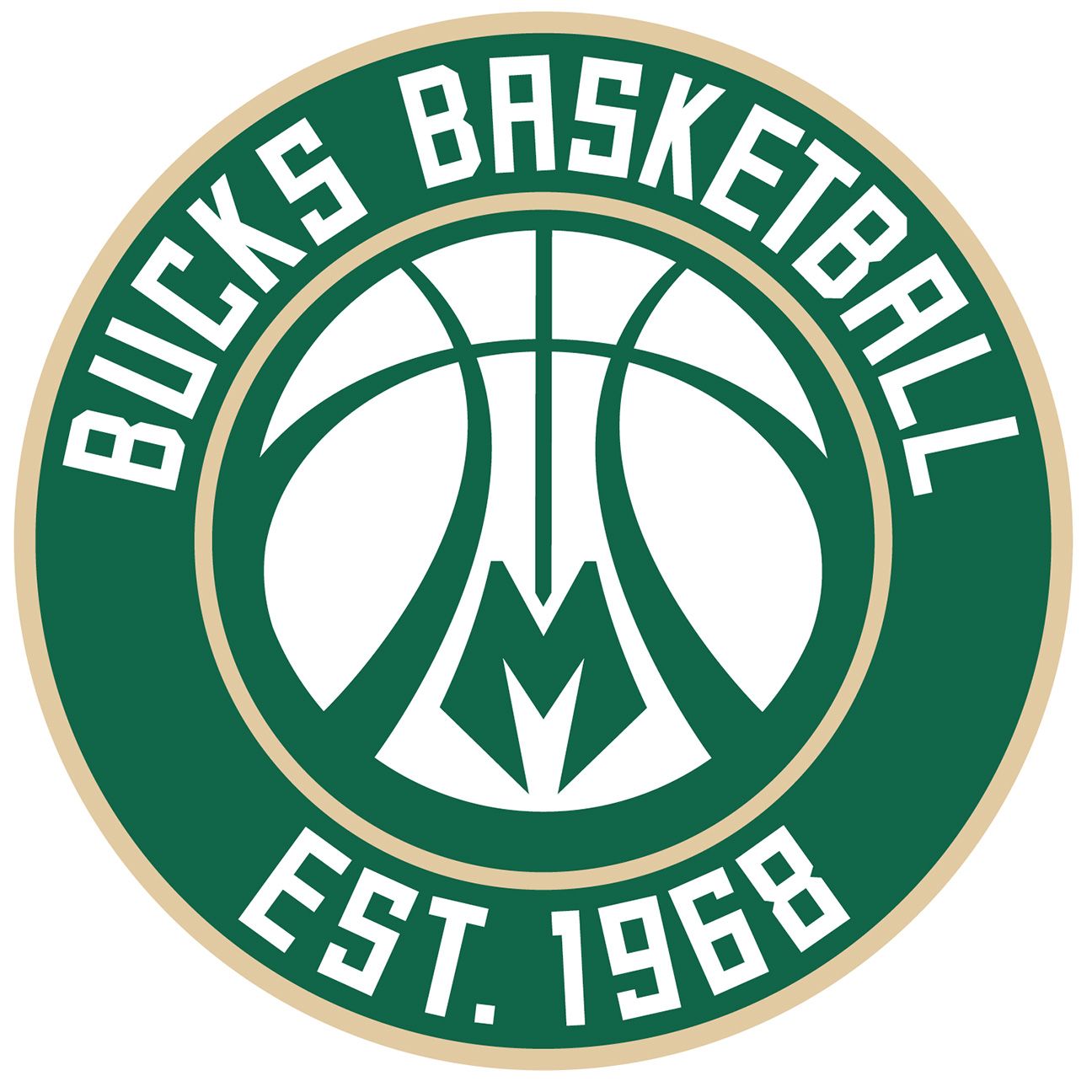
The team's familiar deer's head logo has been reimagined. The inner antlers suggest the shape of a basketball and the chest looks like an "M," both of which appear in the new secondary logo.
Uni Watch's take: A mixed bag. The new deer has more character than the old one, but the slanted eyes feel like too much of a "tough mascot" cliché. And while the basketball within the antlers is a nice touch, the ball-based secondary logo feels a bit generic. Similarly, incorporating the "M" into the deer's chest is clever, but the "M" logo by itself looks more like a minor league baseball logo.
The tertiary logo
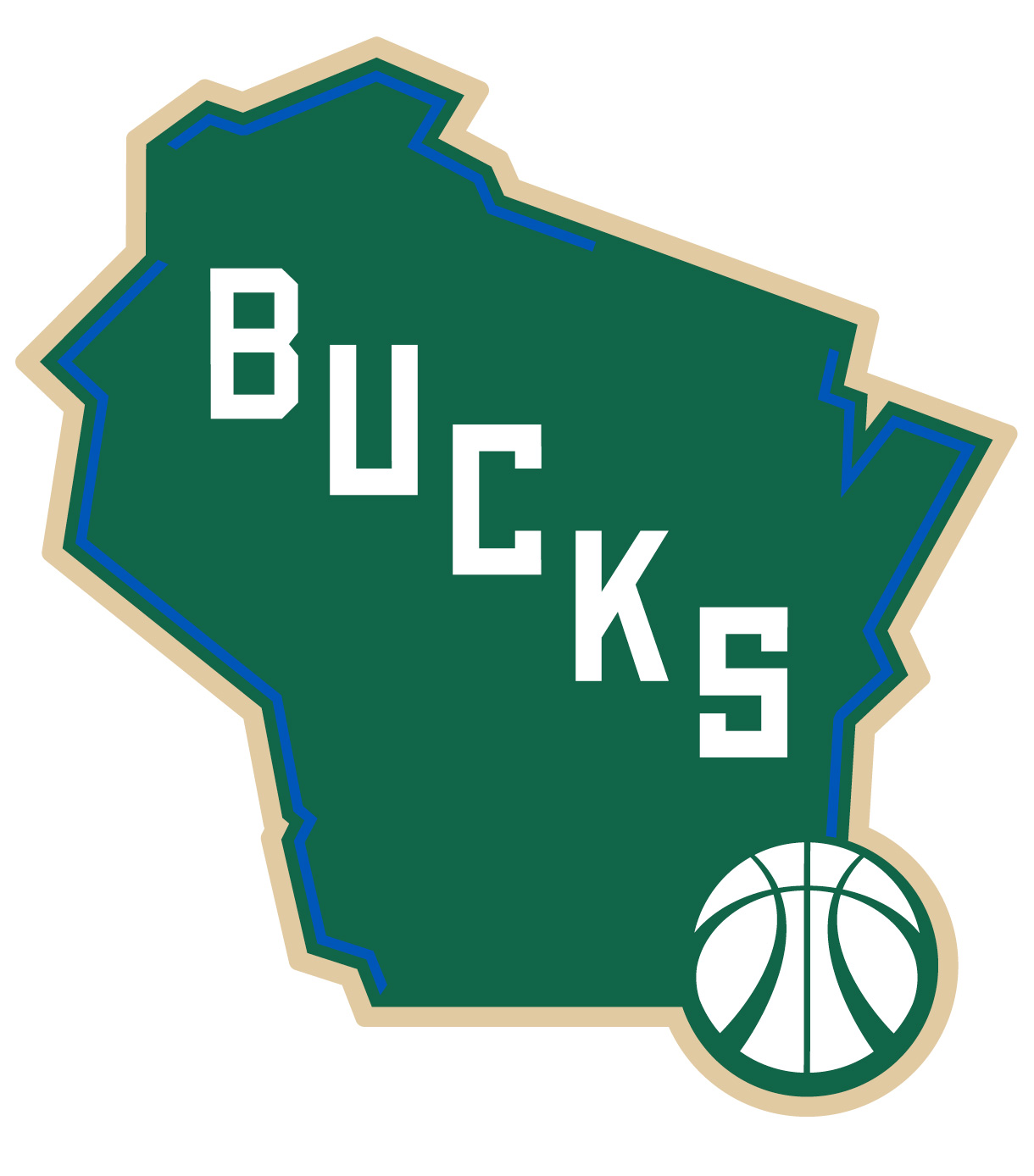
Here we have a stylized shape of Wisconsin with the team name shown in diagonal lettering. The strips of blue show the areas where the state is bordered by water.
Uni Watch's take: Very nice. Here's hoping this logo gets a lot of use in the team's marketing and promotional campaigns.
The typeface
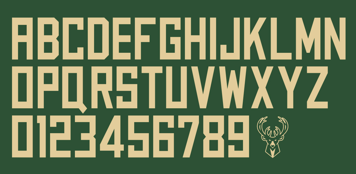
While the rest of the sports world is going with pointlessly eccentric typefaces that are often hard to read, the Bucks have opted for a straightforward block font. In addition to being used on the logos, this font will also be used for the team's new uniforms, due to be unveiled in about two months.
Uni Watch's take: Kudos for keeping it simple. But here's a little nugget of what might have been: At one point the design team tinkered with giving the type a drop shadow. We wish they had stuck with that -- it looks so good!
Overall, a solid B seems like a fair grade for what we've seen so far. But that grade will go up when the uniforms are unveiled.
Stay tuned -- tomorrow we'll have a comprehensive behind-the-scenes look at how the Bucks' redesign was developed.
Paul Lukas wouldn't mind seeing other teams making use of cream in their color schemes. If you liked this column, you'll probably like his Uni Watch blog, plus you can follow him on Twitter and Facebook. Want to learn about his Uni Watch membership program, be added to his mailing list so you'll always know when a new column has been posted or just ask him a question? Contact him here.