
Having written a couple of blogs unpicking the value of innings-to-innings consistency among batsmen and bowlers, I'm now turning my attention to variability of performance over longer periods. In these analyses, I look at how players' careers are made up of spells of relative success and failure. In other words, what I'm interested in is the statistical basis of what we often call form. Once again, I'm going to start with batsmen and, for reasons of space, I've concentrated on Test cricket only.
The key statistical technique I have used to look at this issue is the simple moving average. That is to say, I have cut up each player's career into a series of overlapping blocks of the same length, and calculated his average for each block in turn. In my base case, the length of block I have chosen is 20 innings. This means that we start with the individual's average over his first 20 innings, then we look at innings 2–21, then innings 3–22, and so on. (There are good arguments for using a slightly more sophisticated kind of moving average; if you're interested in why I didn't, please see the Technical Appendix at the foot of this blog.)
Later, I'm going to do some number-crunching on the results of my analysis but, to begin with, I want to do something a bit simpler. I want to draw pictures of the results. By and large, I think that cricket statisticians tend to be pretty poor at finding helpful ways of visually presenting the scads of data we often turn out, and we could all do with giving more thought to information graphics. There's a couple of visualisations we routinely see on telly (especially in limited-overs cricket, in which the so-called "worm" and "Manhattan" are used with some frequency), but I'm convinced it would be useful to have an awful lot more tricks of this kind up our sleeves. [Note: I drafted this paragraph before Anantha published his most recent It Figures blog, which I was really pleased to see.]
I find it particularly remarkable that there is no common way of depicting individual players' career records over time (what a statistician would call a longitudinal approach). We all know that, to one degree or another, all players go through peaks and troughs of performance, and that the career stats with which they end up iron out the kinks in their record, through the magic of aggregates and averages. I think it would be great to have a way of thinking about – and looking at – the information that gets lost.
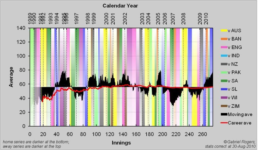
So, in this column, I am introducing my stab at plugging this gap. Because I'm a statistician, I call it the Longitudinal Career Graph (LCG for short); if I were a telly producer, I'd probably call it an iceberg plot, or something like that. An example is shown in Figure 1, depicting Sachin Tendulkar's test batting career. There are two key features:
*Firstly, the player's moving average throughout his career is given in the shaded area. It is shown relative to his long-run career average, which is pegged to the central axis: whenever the black area is above the axis, the player averaged more over the previous 20 innings than he did over his whole career and, whenever the black area is below the axis, his average for the last 20 innings was worse than he achieved in the long run. The advantage of presenting the data in this way is that it allows us immediately to see a given player's hot and cold streaks in relation to his overall level of performance (which is important because, of course, the kind of figures that constitute a purple patch for one player might represent a dry spell for another).
*Secondly, the evolution of the player's career average over time is indicated by the red line (this is a straightforward depiction of what Statsguru calls the cumulative average). Because the final career average is the point of reference for the moving average plot, the red line will always end at the exact point around which the black area pivots.
(By the way, I'm not going to use them here, because I can't squish them into the 470 pixels Cricinfo give me to play with, but I've also developed a flashier version which gives more context about where and against whom runs were made – here's Tendulkar again, as an example.)
As you get used to reading these graphs, you'll come to recognise that Tendulkar's LCG shows a pretty constant level of achievement, without too much in the way of dramatic swings of form (that is to say, there's not a whole lot of black on his graph). Nevertheless, we can see relatively good and relatively bad streaks, perhaps most obviously over his last 50 or 60 knocks, with an apparent drop-off in form reaching a nadir at the turn of 2007, and then a distinct renaissance over the last two years (over his last 20 innings, he averages 78.22, with 7 hundreds, which isn't far behind his best-ever 20-knock streak of 81.17).
If you prefer a few more thrills on your rollercoaster ride, how about Mohammad Yousuf's test career, shown in Figure 2? There's a lot more shaded area on his LCG, indicating that his career has been subject to more dramatic ups and downs. Most conspicuous of all is the amazing peak he reached at the end of 2006. In the 20 innings from the tail-end of 2005 to that point, he scored 2011 runs at an average of 105.84, reaching three figures in precisely half of those 20 knocks. There are troughs to go with the peaks, though, including one at the present moment (he averages 31.80, without a single century, in his last 20 Test innings).
So much for pretty pictures; what about some numbers? The question I address, here, is which cricketers' careers appear to have been more (or less) streaky. In order to quantify streakiness, I use a measure that is directly related to the area of black on each batsman's LCG – the greater the area, the streakier the player. [Technically, the measure is the root mean squared deviation of the moving average relative to the long-run career average, which is then scaled by the overall average, to provide CV(RMSD).] Table 1 gives a list of the most and least streaky batsmen in Test history, sorted according to this measure.
Streakiest of the lot is Mike Gatting. His career consisted of three clear phases: to start with, he looked like he was going to fail to live up to the reputation he had gained in county cricket, with a moving average between 20 and 30 for his first fifty or so Test innings; then, he found his feet at Test level and, for the next fifty knocks, his moving average was over 40 (and, at its peak, rose to 86.92); that level of achievement couldn't last, however, and he sank back to 20–30 when he was recalled in the 1990s. The upshot of all this is that Gatting's career average of 35 is a terrible estimator of how he performed at any one time – he was either much better than that or much worse, depending on which phase you caught him in.
The best-ever 20-innings streaks are Bradman's, naturally (in fact, there are only nine batsmen who have achieved over 20 innings what Bradman managed to sustain over a whole career four times that length). Behind the Don, we find Shivnarine Chanderpaul, who, from the second innings of the Old Trafford Test of 2007 until the first innings in Napier the following year, averaged 122.09. That streak produces a dramatic peak in his LCG (Figure 4), one that is exaggerated by the notable dips in performance that are also evident – indeed, no-one's best and worst streaks encompass such a broad range as his.
Another remarkable case is that of Aravinda de Silva. There is a massive gap in average between his worst 20-knock streak (18.20) and his best (103.40), but what makes this gulf doubly notable is that the two streaks were almost directly consecutive (there was just one innings between them).
At the other end of the scale, the least streaky batsman in Test history was one of Gatting's opponents on the most infamous day of his career (and a fella who happens to be on the radio as I draft this), Rameez Raja. His LCG shows that he had almost no form-related deviations in his career. He averaged 33.37 over his first 20 test innings, and scarcely deviated from that level at any stage in his career, ending with a long-run average of 31.83. In his best 20 innings, he averaged 38.95; in his worst 20, 26.37.
It's not a surprise that the ranks of the least streaky include several batsmen whom I previously identified as having consistent records on an innings-to-innings level. Mark Richardson is there, and it is further evidence of his consistency to see that his 20-innings moving average never dropped any lower than 35.40 (only 11 players have done better than that). Other players who feature in the most consistent 20 of both lists are Richardson's namesake, Peter, Alastair Cook (more about him in a minute), Ranatunga, Bravo, Rameez, Chauhan, Greig, and Stollmeyer. It stands to reason that the batsmen with least variability in their records would also be those whose average stayed pretty constant throughout.
The same isn't true at the other end of the list, however: the streakiest batters are not the same ones who appeared least consistent on an innings-to-innings level. To start with, this surprised me but, after a moment's thought, it makes perfect sense: if your performance in any given innings is unpredictable, then you're less likely to end up with extended phases of good and poor performance (and, if you were consistently poor, then you'd be dropped).
Unlike innings-to-innings consistency - which I showed to be weakly, but identifiably, correlated with both higher runscoring and likelihood of victory - there is absolutely no evidence of an association between streakiness (or the lack of it) and overall batting average or win-rate (r 2=0.001, p=0.507 and r 2<0.001, p=0.648, respectively). Some good players have up-and-down records; others are much more stable. There's no evidence of an overall advantage for either profile.
The analyses above are all well and good, but do they really help us to understand form? In order to answer that question, it is important to make a distinction between a run of good (or bad) form and a run of good (or bad) scores. Batsmen themselves sometimes make a very similar point, especially when it comes to streaks of low scores (how often did Michael Vaughan tell us he was in great nick; he just kept getting out?) It is central to this argument – and central to the science of statistics – that we should attempt to distinguish any real trend from the influence of chance. If you roll a pair of dice many times, you're bound to observe runs of high scores and runs of low ones, even though the probability of getting any particular result is the same every time you roll the dice and, in the long run, the overall average will be 7.
The way in which we tend to think of form in cricket is not like this at all, though: it is much more like imagining that there are series of rolls when the dice are weighted to make a high score more likely, and series of rolls when low ones are most probable. So how do we distinguish between the two models? The key to the answer is that, if you had a pair of non-constantly weighted dice, you would observe greater variation in your overall series of rolls than you would if there was nothing but plain old luck at play.
To apply this principle to cricket data, I used a statistical technique called bootstrapping. I took each batsman's career and put the innings in a random order, to create a new virtual career, but one in which the sequence of knocks is based purely on chance, with no fundamental underlying trends (i.e. no form). For each batsman, I generated 10,000 form-free careers of this type. Then I compared the amount of variability in the random careers with what we see in the batsman's real record. In particular, I worked out the proportion of simulations showing at least as much streakiness – i.e. at least as high a RMSD based on the 20-innings moving average – as the batsman's actual career. This gives us an estimate of the probability that a career as streaky as (or more streaky than) the batsman's real one would have arisen even if there was no underlying variation in form. A statistician would call this estimate an empirical one-tailed p-value.
The p-value for each player is given in Table 1. It will be clear from the explanation above that small p-values (indicating a low likelihood that the player's career would have turned out at least as streaky as it did through chance variation alone) increase our confidence that there probably is evidence of form-related fluctuations in a player's career.
To give one obvious example: it seems extremely unlikely (p=0.007) that a career with the profile of Mike Hussey's would have developed unless there was some kind of variation in his underlying run-scoring capacity (i.e. form). His LCG (Figure 6) gives a fairly dramatic depiction of the deterioration (and subsequent slight resurgence) in his scoring.
A few other players have careers that show the opposite profile; for instance, chance seems like an unlikely explanation of the clear upward trend to Daniel Vettori's Test batting career (p=0.018). Others have careers that are too up-and-down (Yousuf, Chanderpaul, de Silva), or too dominated by one atypical peak (Gatting, Vengsarkar) to be likely to have occurred without some underlying variability in form.
However, it turns out that cases like these are the exception rather than the rule. In a substantial majority of cases, the careers batsmen end up with are perfectly consistent with the hypothesis that an individual's long-run average provides a reasonable estimator of his run-scoring ability throughout his time in the game. This suggests pretty strongly that a lot of what we think of as form is really just random variation – the streakiness of the evenly weighted dice. Cricket fans are not alone in this: it is very well established that human beings – and perhaps especially sports fans – have a pretty poor appreciation of the play of chance (a phenomenon known as the clustering illusion).
A case in point is Alastair Cook. A couple of weeks ago, gallons of newsprint were spilled describing his supposed slump in form. However, it turns out that his is one of the least form-inflected careers of all, as his LCG (Figure 7) shows. Even before his recent Oval revival, he had averaged 39.16 in his last 20 Test innings – hardly setting the world on fire, but hardly the record of a lost cause, either. In fact, his best-ever 20-innings run in Test cricket is 53.24, and his worst is 32.00 and, in the grand scheme of things, this is not very much variation at all. This much can be inferred from the fact that the streaks overlap: there are 11 innings that appear in both!
When I took Cook's innings and put them in a random order 10,000 times, a huge majority – 9,925 – of those virtual careers showed greater streakiness than we see in his actual career. If you could see the LCGs of the form-free careers, they would almost all have conspicuously more black on them than we see on Cook's real-world graph (in the most extreme, "Cook" averaged 20.55 in one 20-innings streak and 91.19 in another). And just about all of them contained at least one cold streak that looks much worse than his recent slump.
In fact, Cook is just an extreme example of a phenomenon that is very widely observed in this dataset. Brian Lara was in an extraordinary run of good form when he averaged 83.89 in 20 consecutive innings in 2004–05, right? But shuffle his scores around at random and just over three quarters of the careers you produce will contain a streak just as hot. There's a greater weight of evidence to mark out Rahul Dravid's slump of a couple of years ago as "real" but, still, put his innings in any old order and, about 15% of the time, you'll end up with a trough at least as deep. That's a degree of uncertainty that would be very unlikely to convince statisticians in any other field that we were looking at anything other than a blip.
In this respect, I hope that, as the pressure mounted on Cook, he adopted an attitude similar to that advised by Greg Chappell (as quoted by Aakash Chopra in this column): "When not in form you should look back at your career stats. More often than not you'd find that you scored runs in every fourth or fifth innings, and hence every innings of low score is actually taking you closer to the innings in which you'd score runs." This is, doubtless, excellent advice from a psychological perspective and it's almost excellent advice from a statistical perspective, too (although we should be careful of the gambler's fallacy – that is, assuming that streaks are liable to correct themselves by some sort of "law of averages"). What we can say is that many apparent slumps like Cook's recent one are, mathematically speaking, entirely consistent with simple random variation around a constant mean that is well estimated by the batsman's career average. Or, in other words, form is temporary, but class... well, even if it isn't permanent, it seldom fluctuates much.
Technical appendix
1. To start with, an acknowledgement. The approach set out in this blog is heavily influenced by (and, in some places, directly pinched from) Curve Ball, an excellent book on baseball stats by two academic statisticians. (It's aimed at people who are fascinated by baseball and mildly interested in numbers, but I've found it works just as well for those of us who'd put that the other way around.)
2. It may be noted that, although I've presented some p-values, I haven't, at any stage, used the dread words statistically significant. Conventionally, we talk about a finding being significant if its p-value is lower than some threshold. That threshold is very often 0.05 – equivalent to saying we'll accept a 1-in-20 chance of considering our finding significant when, in fact, it's just a fluke. I'm wary of this approach, for a couple of reasons: firstly, the threshold is always arbitrary, and always involves a trade-off between type I and type II errors (in other words, the more cautious you are about interpreting something as significant, the greater the chance that you'll falsely classify something as non-significant). Secondly, there's a problem, here, with multiple testing. There are 255 batsmen in the dataset, so we'd expect to end up with 12 or 13 with p-values less than 0.05 just by chance. You could correct for this, using Bonferroni methods or similar, but I took the view that that would be complicated to explain, probably unnecessarily conservative, and would put too much stress on my approximated p-values (it would require p to be accurate to five or six decimal places, and you'd need a lot more than 10,000 samples to establish that). For these reasons, I present my p-values without correction and without (much) comment.
3. Whenever an analysis is dependent on a statistician's arbitrary choices, it is crucial to examine how much of an influence these decisions had on the results of the analysis. This is a process known as sensitivity analysis, because it analyses the extent to which the outputs of the process are sensitive to its underlying assumptions.
I did loads of these analyses. The most obvious place to start is with the size of the window over which the moving average was calculated. I looked at longer and shorter windows; here are the results for 10 innings and 30 innings. You'll see that neither list is terrifically different from the 20-innings analysis. It's interesting to see that there have been a few players who've managed 10-innings streaks with higher averages than Bradman's best; highest of all is Kumar Sangakkara's 2006–07 effort of 1,185 runs with 6 hundreds (5 of them 150+) at 197.50. No one other than Bradman has ever sustained an average of 100-plus for 30 innings, though.
Another obvious sensitivity analysis is to question the use of the simple moving average at all. The measure has some disadvantages, the most notable amongst which is that it can appear to be driven not by what's happening at a particular moment in time, but by what happened 20 innings before (take another look at Tendulkar's LCG: that sudden drop-off towards halfway through 2005 comes about because it's the point at which his 241* at the SCG in 2004 is more than 20 innings ago and, thus, falls out of the calculated moving average). An alternative approach that minimises this problem is the exponentially weighted moving average, in which innings are never completely discarded; they just receive ever-decreasing weight as they recede into the past. I chose not to use this method, in my base case, because it answers a slightly different question – something like: taking into account everything we know about a player's career to date, and placing more importance on his most recent outings, what kind of form was he in at any given instant? This is a valid question that might have its uses (perhaps if you were trying to predict how well you expect the player to do in his next innings – although it doesn't answer that question very well). However, it's not quite what I'm interested in, here, which is capturing how well a batsman did over a given phase (and, in that context, I think it's entirely appropriate that the measure should be influenced by notable scores falling out of the window of interest).
Nevertheless, to investigate how much difference the alternative approach makes, I redid all the analyses detailed above using EWMAs instead of the simple moving average. The weighting coefficient I used was 0.066967, which may sound like a weird number, but it's the one that dictates that the weight applied halves every ten innings (so ten innings ago is worth 50% as much, 20 innings ago 25%, and so on). The results table is here. By and large, there is very little difference between these results and those calculated according to the simple moving average. Maybe this mode of analysis gives very slightly more prominence to players who have a distinct trend to their careers (either worsening – a la Adams and Hussey – or improving – like Vettori and Imran). On the whole, though, I can't tell much difference between them.
4. If any statsheads read my methods and inferred (correctly) that I used bootstrap sampling without replacement, and thought that I really should have used a with-replacement approach, it's a fair cop. I just thought it'd be much easier to explain the process as shuffling the deck rather than sampling from a theoretical distribution approximated by the empirical dataset. I did some sensitivity to show that it doesn't make a huge amount of difference, in this case, but I accept that with-replacement is theoretically the better approach (plus, of course, it allows you to do amusing things like estimate confidence intervals for the batting average) (another time).