As you've probably heard by now, the Charlotte Bobcats will become the Charlotte Hornets in 2014, which means they'll need new uniforms. One option, of course, would be to reclaim the colors and unis worn by the original Hornets (who then moved to New Orleans and have now been renamed as the Pelicans), but team owner Michael Jordan says he hasn't yet made up his mind about that.
While MJ's pondering his options, we thought we'd give him some additional food for thought by inviting Uni Watch readers to come up with new designs for the team. Here are the most successful concepts that showed up at Uni Watch HQ (for all of these, you can click on the design to see a larger version of it):
1. Best Use of Honeycomb: Brian Archambault
Yes, hornets make nests with hexagonal comb patterns. Technically speaking, this isn't honeycomb, because hornets don't make honey, but everyone tends to call it honeycomb anyway, so we'll do that, too. By any name, lots and lots of readers embraced the honeycomb motif (some of them going a bit overboard), but none did so as effectively as Archambault, who included just enough of a comb pattern without overdoing it. Love the color scheme and the stripes down one side of the uni, too. (Archambault also submitted a purple and teal version of the same design, but that one just doesn't feel as right.)
2. Best "It Ain't Broke, So Don't Fix It" Uniform: Conrad Burry
Burry's design is clearly inspired by the original Hornets uni set from the late 1980s but feels just modern enough to qualify as an updated classic. Nicely done.
3. Best "Nothin' Fancy" Uniform: Ethan Dimitroff
Basketball uniforms don't get much simpler than what Dimitroff's proposing here, but sometimes the simplest approach is the best one. And the gold trim really works on all three uniforms.
4. Best Pinstripes: Chris Pauwels
The Hornets' original uniforms had pinstripes, so many readers included stripes in their designs. But Pauwels is the only one who used divergent pinstripes. Not sure how that would look in the real world, but it looks pretty cool on his mock-ups. Also: Surprisingly effective use of orange, which really pops as an accent color. More NBA teams should do this, since the basketball itself is orange.
5. Best Concept That Really Has Nothing to Do With the Hornets: Brendan Jang
"I chose the concept of 'in the paint' as a generally positive basketball term but modified the meaning a bit and used actual paint themes," Jang says. It's a really fun concept -- great mascot character, too -- but you could pretty much apply it to any team, so it doesn't feel very Hornets-y. Then again, most basketball uniforms are just letters, numbers, and colors, so why not think more creatively?
Honorable Mention — Best Fierce Logo: Bradley Farrell
Now that's a nasty-looking hornet! Might actually be too insect-y for some fans, but it's a big hit here at Uni Watch HQ.
Honorable Mention — Best Even Fiercer Logo: Brent Hatfield

Hatfield's hornet is almost comically aggro -- so over the top that he's kind of endearing. Imagine the live costumed version of this fella!
Honorable Mention — Best Shorts: James MacNeil
Look how the uni number is highlighted in the string of honeycomb cells -- clever!
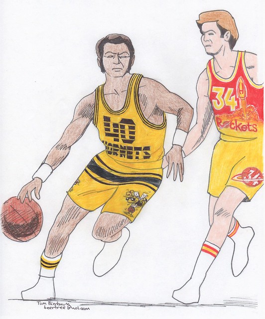
Honorable Mention — Best Non-Hornets Redesign: Tom Bierbaum
Bierbaum's contest entries always include action illustrations that show new uniforms for two teams. In this case, his Hornets makeover doesn't quite work, but check out that Rockets player -- now that's a killer design! Would love to see that on the court. (And his Hornets road uni mock-up included a pretty cool Mavs redesign.)
Want to see more? You can check out all of the reader-submitted contest entries here.
Paul Lukas would like to thank everyone who submitted entries for this contest. If you liked this column, you'll probably like his daily Uni Watch web site, plus you can follow him on Twitter and Facebook. Want to learn about his Uni Watch Membership Program, be added to his mailing list so you'll always know when a new column has been posted, or just ask him a question? Contact him here.


