As we explained a few weeks ago, LeBron James' return to Cleveland won't result in the Cavs getting new uniforms, at least not for another year or two.
But Uni Watch fans see no reason to wait that long. Over 100 submissions came in for our latest uniform-redesign challenge, which was to create a new look for the Cavs. Here are the most interesting designs that came in (for all of these images, you can click on the design to see a larger version of it):
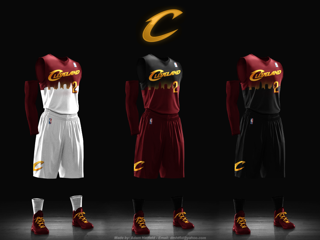
1. Best Skyline-Based Design: Adam Hatfield
Several readers came up with designs that incorporated the Cleveland skyline. Adam Hatfield's was the most audacious of these, with a gradation effect that suggests a sunset -- or is it a sunrise? -- behind the skyscrapers. Nicely done. (Also worthwhile: The skyline-based submissions from Brandon Parker and James Sismanes.)
• • •
2. Best Design Based On One of History's Worst Designs: Adam Hatfield
It's rare for us to recognize the same designer twice, but sometimes you just have to say, "Yeah, this guy's got the goods." For this concept, Hatfield took inspiriation from the Cavs' late-1990s uniform set -- widely considered to be among the worst in NBA history -- and improved upon it by using an updated color scheme and a more sedate treatment for the shorts. (TJ Vedegys took a similar approach.)
• • •
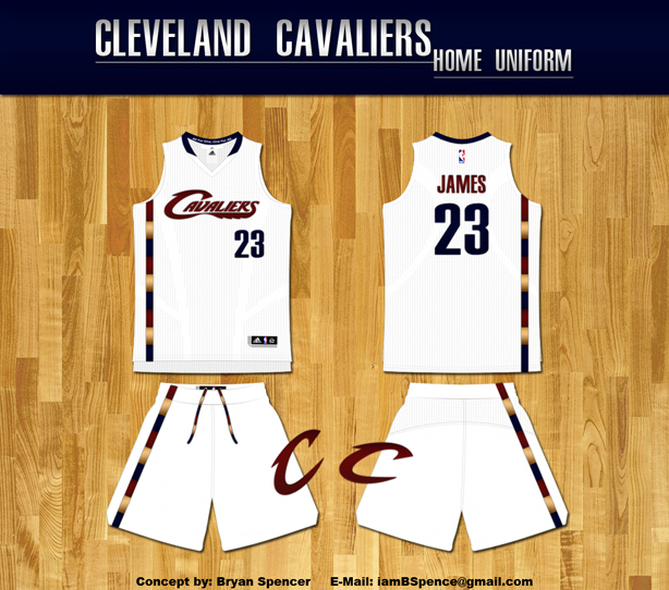
3. Best Obsessive Detail That Doesn't Even Matter (Except It Totally Matters!): Bryan Spencer
Lots of readers submitted uniform concepts that included visual shoutouts to the Cavs' multi-colored trim from the late 1970s. As you can see above, Bryan Spencer took a fairly nuanced approach to this design element, but he included a killer detail: multi-colored waistband laces on the shorts (which were also included in his road and alternate designs). Granted, a player's shorts laces usually aren't even visible, so the lace color is arguably irrelevant, but this is precisely the kind of brilliantly obsessive detail that can put a design over the top. (Others making interesting use of the multi-colored trim included Ethan Dimitroff, Conrad Burry, Todd Irwin, David Miller, Michael Selan and Simon Chen, among others.)
• • •
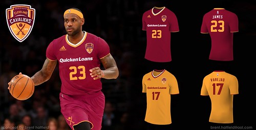
4. Best Design That Probably Represent The NBA's Future: Brent Hatfield
Rumors continue to swirl regarding when the NBA will move forward with its long-threatened program of adding corporate advertising to jerseys. The league's plan would reportedly use small patches, but Brent Hatfield (no relation to Adam Hatfield!) has taken the idea to its logical conclusion: a soccer-style chest sponsorship, with the team identity relegated to a small patch. (As an aside, this was also one of the very few submissions to include sleeves, which suggests that NBA fans -- or at least Uni Watch readers -- haven't yet bought into the league's sleeved revolution.)
• • •
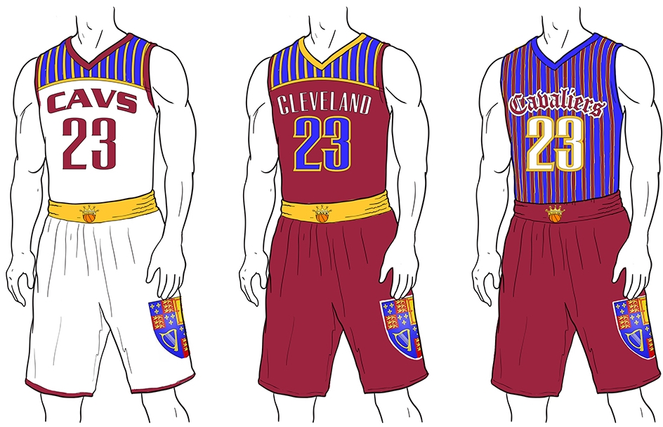
5. Best Design That Everyone Else Will Hate: Tim Douglas
Old-school regimental stripe patterns are very popular here at Uni Watch HQ, and they play nicely into the Cavaliers' swashbuckling team name (as do the crest on the shorts and the Gothic lettering on the alternate jersey). This design has zero chance of ever seeing the light of day, of course, and most other observers will probably find it garish and then some, but at least one fan -- this one -- would love to see it on the court.
• • •
Honorable Mention: Edmund Cablao came up with a nice gold-trimmed update to the original LeBron-era design. ... Chris Spisak made a surprisingly effective improvement on the Cavs' current design just by adding some blue accents to the home design and changing the road typography from gold to white. ... James MacNeil came up with a retro-ish design that's a bit generic -- you could probably plug any team or city name into it -- but is nonetheless appealingly snappy.
• • •
Want to see more? You can view all of the design submissions here. We'll have more redesign contests soon.
Paul Lukas wishes the Cavs would just go back to the original LeBron-era uniforms, which were among the best in the league. If you liked this column, you'll probably like his Uni Watch Blog, plus you can follow him on Twitter and Facebook. Want to learn about his Uni Watch Membership Program, be added to his mailing list so you'll always know when a new column has been posted or just ask him a question? Contact him here.


