The wait is over and was worth it.
When the Professional Women's Hockey League was founded in 2023, it was decided there wasn't enough time before the inaugural season to create names, logos and jerseys they'd adorn. Therefore, teams debuted with geographic names on their jerseys along with unique color schemes.
In September, the PWHL revealed the team names and logos for its six franchises. On Thursday, the league showed what those logos look like on their official home and away jerseys, debuting in the 2024-25 season and available for fans to purchase.
"I am sure I'll cry the first time I see someone wearing one of our jerseys in the wild, whether it's at game or not in a controlled environment," Amy Scheer, PWHL senior vice president of business operations, told ESPN. "I know I'm biased, but I really believe that our names and logos came out really wonderfully and that the jersey designs are just a great expression of our brands. They're bright, they're vibrant, they're really fun."
The jerseys were created in partnership with Creative Agency Flower Shop, Bauer Hockey and the PWHL teams. Kanan Bhatt-Shah, PWHL Vice President of brand and marketing, led the creative process.
Here are the new sweaters in the PWHL, including input from Bhatt-Shah.

Boston Fleet
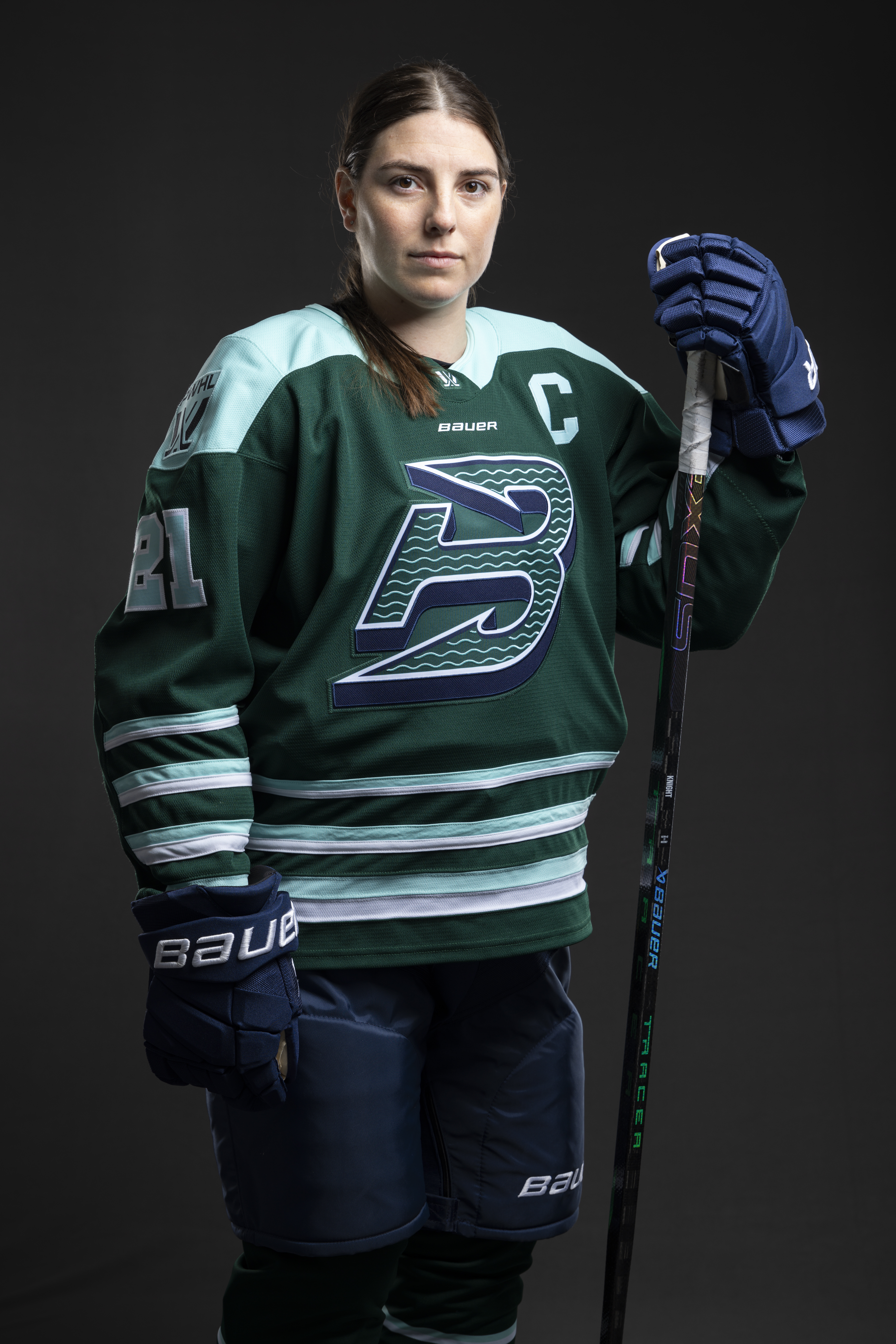
The Fleet's home jersey features a deep green base, complemented by oceanic blue accents on the shoulders, sleeve stripes and waist. The classic hockey design incorporates alternating bands of color, forming a wave-like pattern that evokes a strong connection to the sea. The wave motif is also found inside the team's crest.
"There's this sense of oceanic just enveloping this jersey," Bhatt-Shah said.
Minnesota Frost
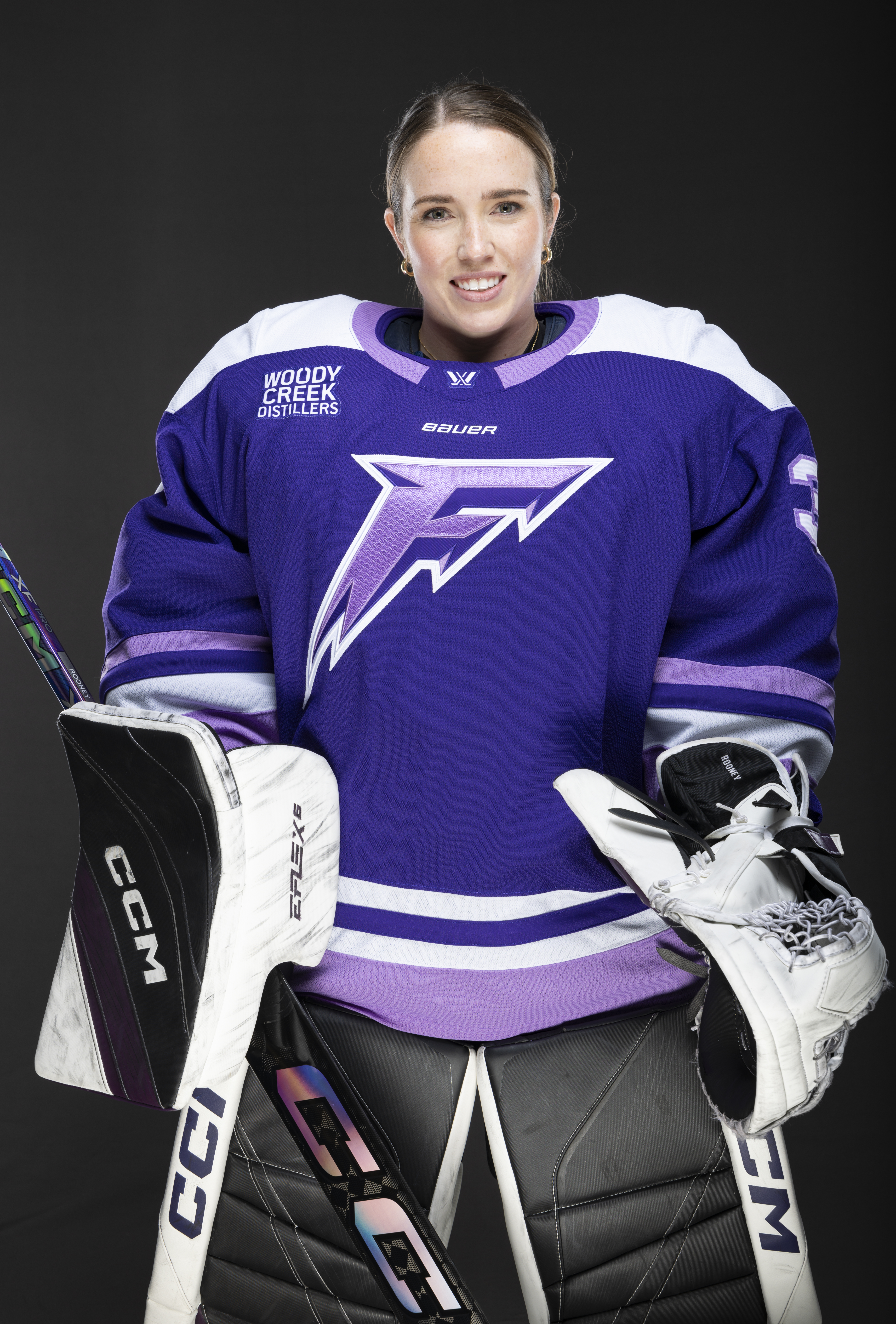
The Frost's home jersey is intended to evoke the chilly spirit of Minnesota winters. White accents on the shoulders, arms and waist add a crisp, icy contrast, capturing the sharpness of the frozen landscape. The team's crest can be found inside the player numbers.
"These white accents [are] really capturing [the] sharpness of a frozen landscape, but then add some lightness to it too," Bhatt-Shah said.
Montréal Victoire
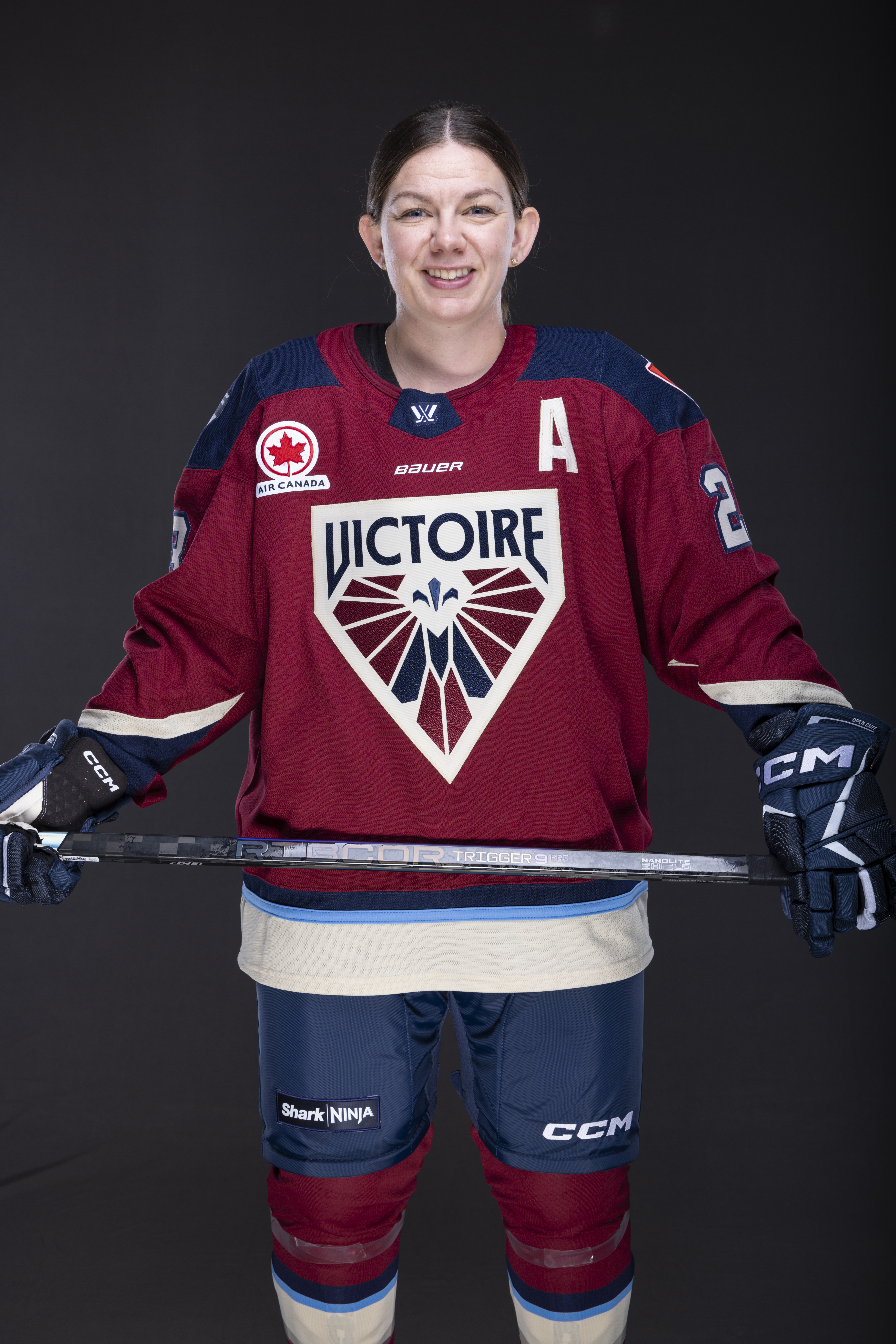
Anchored by the burgundy base, the Victoire's home jersey reflects Montréal's timeless elegance and strength. The jersey numbers are adorned with a Fleur-de lys motif, reinforcing Montréal's cultural pride.
"In our first season, we received tremendous feedback around Montreal's color palette. Just really classic and elevated and timeless. So for us, it was really about how to lean into this timeless sensibility," Bhatt-Shah said.
New York Sirens
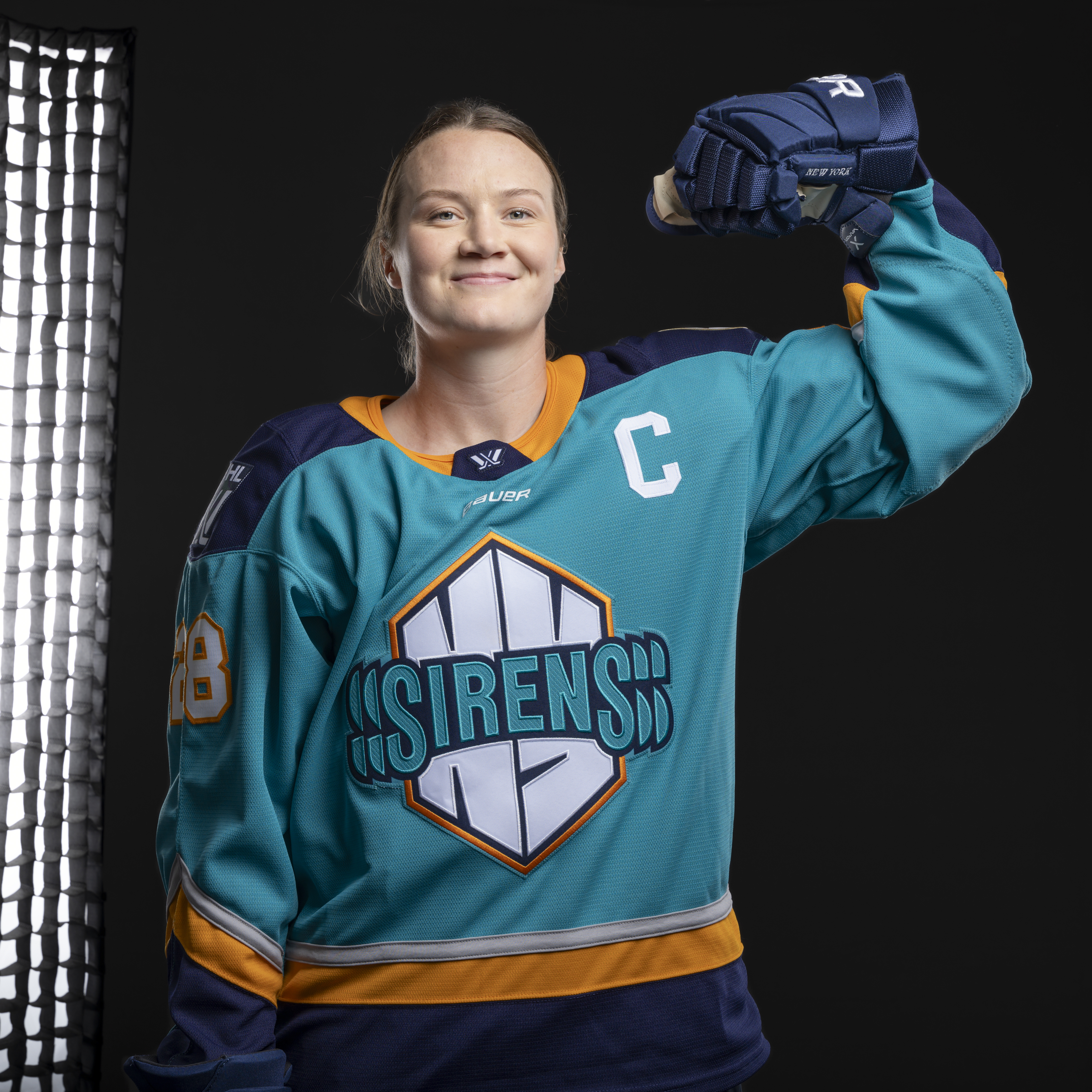
Inspired by the hexagonal shape of their team crest, the Sirens' home jersey captures "the spirit of New York's multifaceted energy." Angular sleeve stripes echoing the crest's geometric form, combine the city's signature navy, orange and gray hues, creating a striking, modern motif. The numbers on New York's jersey features line work inspired by sound vibrations.
"I think for us it is a combination of the 'S's' that really create that feeling of energy but then also these geometric angles where it feels like it all comes together in terms of the city skyline and the architecture," Bhatt-Shah said.
Ottawa Charge

The Charge's home jersey has a vibrant red base, with a bold pop of electric yellow pulses through the design. The overall look captures the energy and intensity of the Charge's presence on the ice. Custom numbers on the jersey incorporate small electrical charges.
"When you do this design in 2-D, it's like, 'OK, I can see it coming to life.' But then we're working with the Bauer team on what stitching are we're going to use, what different applications to the crest we need to really have it capture the essence of the identity," Bhatt-Shah said.
Toronto Sceptres
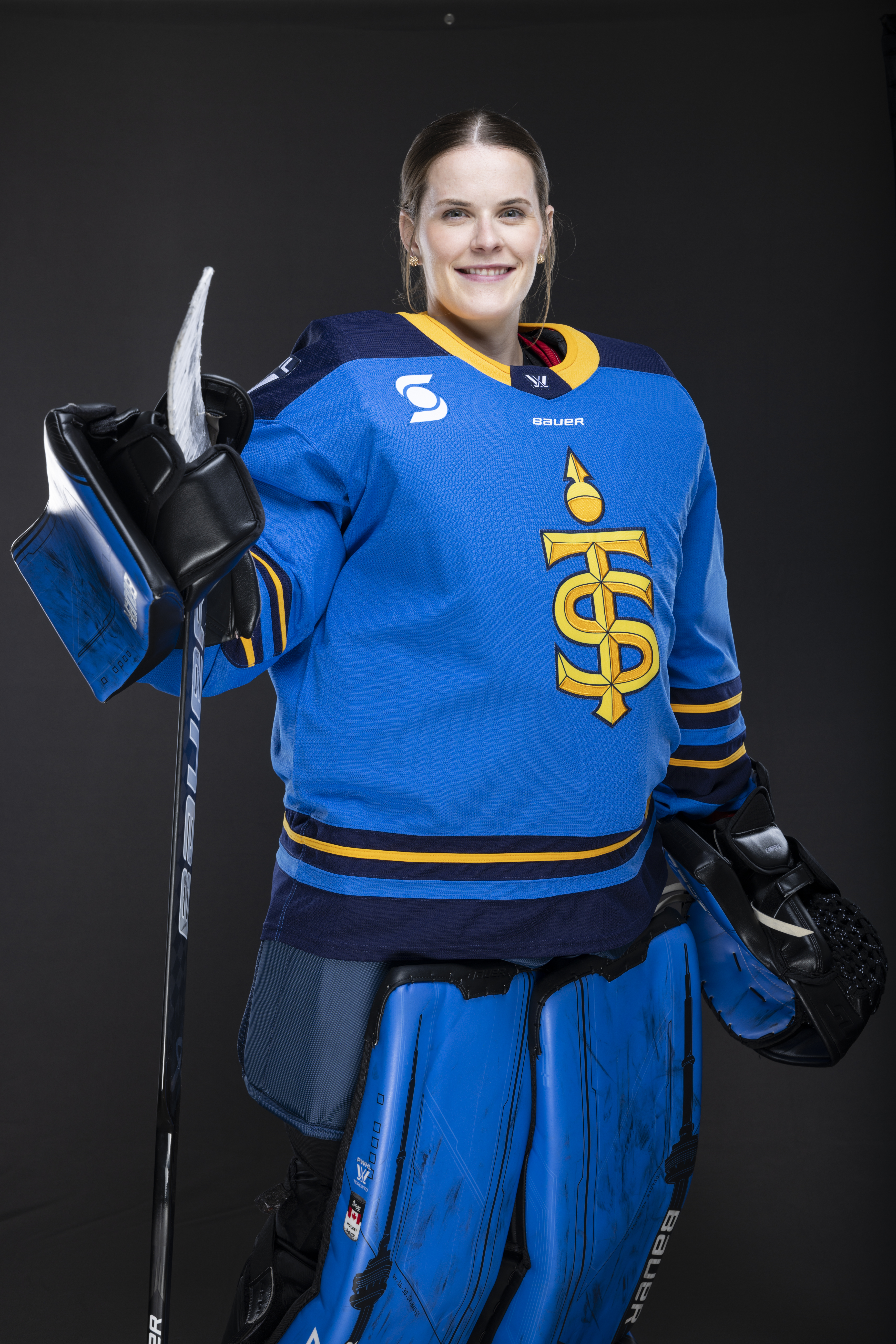
The Sceptres' home jersey has a rich blue base that captures the city's leadership and pride. The striking gold and yellow of the team crest stands out, creating a look with bold presence. Custom numbers incorporate the "orb" from the Sceptres crest.
With the Toronto Maple Leafs and Blue Jays, having a blue base seemed obvious. But the PWHL wanted to make it their own.
"You sort of see different shades of blue, right? There's a navy, there's that rich blue that's a continuation, these pops of gold and yellow. So we think it feels very authentically Toronto, but definitely fits into the identity that we've been building towards since season one," Bhatt-Shah said.
The jerseys are available online exclusively at The Official PWHL Shop, before going on sale on Bauer.com and key retailers in Canada. They come in adult and youth sizes. Only blank jerseys are immediately available, but fans can pre order jerseys with select players' names and numbers on them for shipping in December.
The PWHL said that two players for each team will be initially available, with hopes that full rosters will be available in early 2025.
The names and numbers are crafted from high-quality twill fabric and are stitched directly onto the jersey, rather than being heat-sealed like on typical replica jerseys.
