The Florida Panthers are growing up.
The team unveiled a striking new uniform set -- the first serious design makeover in the franchise's 23-year history -- at a live event at the BB&T Center in Sunrise, Florida, on Thursday night.
The new look was created by the design staff at Reebok, the NHL's uniform outfitter. The Panthers had originally hoped to have the new design ready for the start of the 2015-16 season, but team executives didn't have a realistic idea of how long a complete visual overhaul would take.
It was worth the wait; the new look is a good one. It has several interesting features, which are worth considering one element at a time.
The primary logo: The team's new jersey logo, which leaked in late April, is a shield-shaped design inspired by the logo of the 101st Airborne Division of the United States Army, which Panthers owner Vincent Viola was a member of in the late 1970s. Here's a side-by-side comparison of the 101st's logo and the new Panthers mark, followed by a view of the new logo on the team's home uniform:
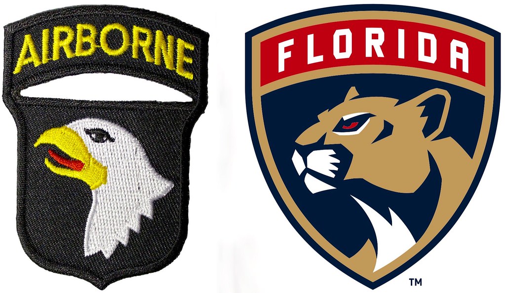

The panther shown in the new logo looks stern and dignified but less ferocious than the team's previous leaping panther mascot. "That was intentional," said John Viola, Vincent Viola's son, who oversaw the redesign. "The old panther, when we were a new team, jumped up and got right in your face. This new panther is more stable, more mature. We want people to be afraid of us because of the talent we have here, not because our logo looks intimidating."
John Viola said the more dignified look also reflects the new design's military underpinnings. "It's important to remember that, in the military ethos, fighting is your last resort, because -- just like with Spider-Man -- with great power comes great responsibility," he said. "All of that is represented in the logo."
OK, so invoking a comic book is a bit corny. But in an era when so much sports marketing features over-the-top intimidating mascots and questionable military imagery, hearing a new design being promoted with words like "mature" and "responsibility" is, frankly, refreshing.
The sleeve patches: The military theme also extends to the jersey sleeves, which will feature an "earn your stripes" patch system.
During the preseason, the sleeves will carry the team's new secondary logo, which shows the Florida state flag topped by a prowling panther. When the regular-season roster is finalized, players who make the final cut will have the words "Florida" (for the home jersey) and "Panthers" (on the road) added above the logo. And, in a unique touch, the team's captain and alternates will also wear "Captain" or "Alternate" banners on the left sleeve:
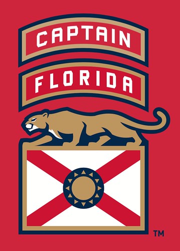
Viola said the team had considered not using the traditional "C" and "A" jersey designations and just going with the "Captain" and "Alternate" sleeve banners. That would have required a waiver from the league office because the NHL rulebook mandates the use of the "C" and "A." But when team officials explored that possibility, they were told there would be no exceptions, so the letters and sleeve banners will both be used.
The horizontal stripe: The home and road jerseys both feature thick horizontal striping that's unmistakably evocative of the Montreal Canadiens' home jersey (although it doesn't wrap around to the back like Montreal's does):
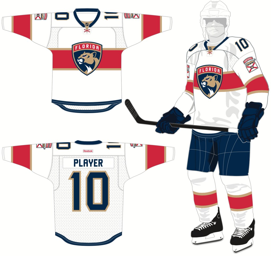
That's a pretty bold move for an expansion franchise in a warm-weather state. What will Montreal fans think about that?
"Well, other baseball teams besides the Yankees wear pinstripes," Viola said. "Montreal is a great franchise with decades of tradition. We don't have their history, but we see ourselves as being on that same level in terms of talent and professionalism, and we hope they're flattered that we were inspired by that visual element. There's certainly room for more than one version of it."
Fair enough.
The collar lacing: Some NHL teams use tie-down collars, with the ends of the laces dangling from the top eyelets. Other teams go with faux tie-downs, which use sewn-in horizontal lacing to simulate the tie-down look. Reebok came up with a unique spin on that approach for the Panthers. The new jerseys' collars have X-shaped lacing, which looks particularly good on the road jersey, because the red lacing on white background echoes the cross on the Florida flag -- a clever touch:
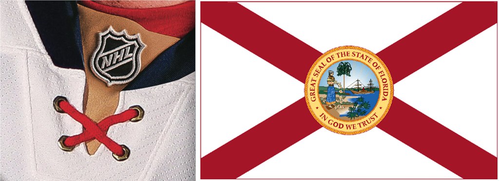
This move is somewhat similar to the tedious "story"-based uniform elements that we hear so much about these days ("The custom font features serifs placed at a 66-degree angle, which honors the archway at the campus entrance ..."), most of which feel like rote gimmicks that nobody will remember the day after the unveiling event. But there's nothing wrong with a gimmick if it's a good gimmick, and this one is ingeniously simple and is bound to resonate with Florida fans.
The helmet decal: The team's old leaping panther logo has been streamlined. The new version will be worn as a decal on the players' helmets. Here's a side-by-side comparison of the old version (on the left) and the new:
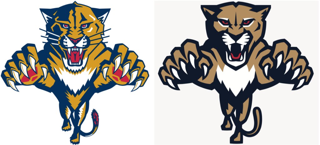
"Believe it or not, we went through about 20 versions of that," Viola said. "We wanted it to look close enough to the old version so that it represented continuity, but different enough so that it also represented evolution." Mission accomplished.
The new identity system isn't perfect. The most obvious problem is that Florida already has a pro sports team whose primary logo (a) is shield-shaped; (b) features a cat's head; and (c) has the stated goal of honoring the military:
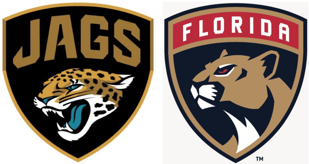
Overall, though, this is a well-conceived redesign, and a good example of a team's look growing into adulthood. Nicely done. Grade: A-
Paul Lukas looks forward to seeing the Panthers' new uniform set on the ice this fall. If you liked this column, you'll probably like his Uni Watch Blog, plus you can follow him on Twitter and Facebook. Want to learn about his Uni Watch Membership Program, be added to his mailing list so you'll always know when a new column has been posted or just ask him a question? Contact him here.
